The basics of configuring a text field in the Form Builder | FB_008
In this tutorial, we'll continue the configuration of a basic product using the Infigo form builder. This section looks at the basic configuration of a text field. The end result will be a single text box on our form which accepts a single line text input and places it onto the canvas. There will be no formatting options displayed on the form and end users will not have the ability to format the text using the pop-up.
1. Begin by adding a text field to your canvas
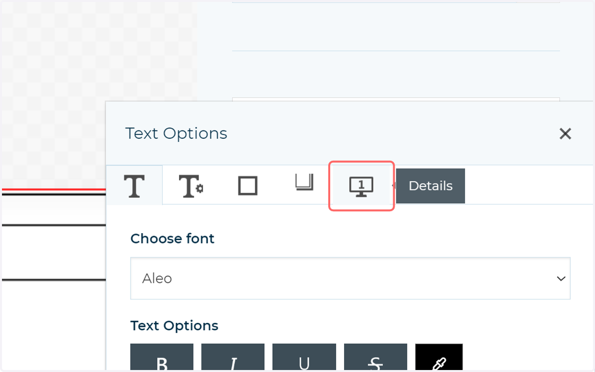
You can format this text field in the usual way. Double click on the field on the canvas to bring up the pop-up filled with configuration options. Amongst many other things, this will allow you to define the font, text size and behaviour when text reaches the end of the field.
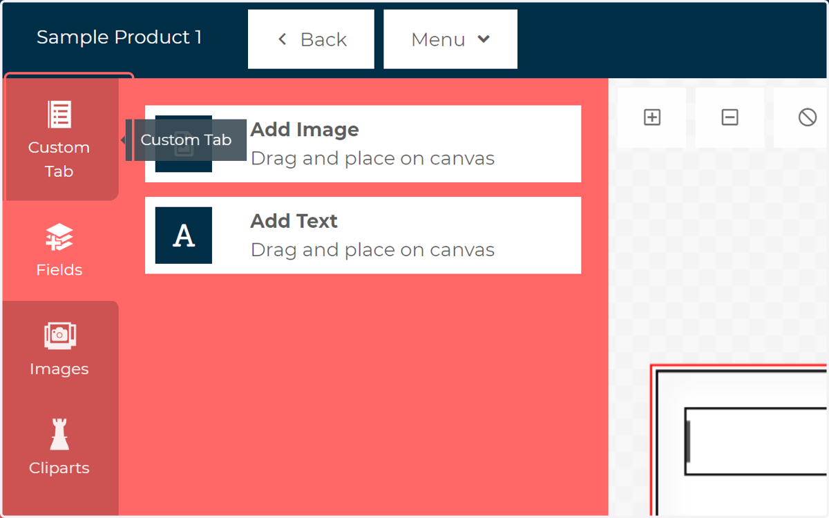
2. Click on Custom Tab
This will display the form builder interface, where a new section will show with all contained options relating to the new text field.
3. Click the field icon to select the field on the canvas
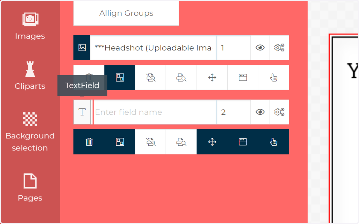
4. Enter a field name
This will be displayed as a title on the form above the input field, and is a useful way to identify a field. Insert "***" before the field name in this box and the name will not be shown on the form.
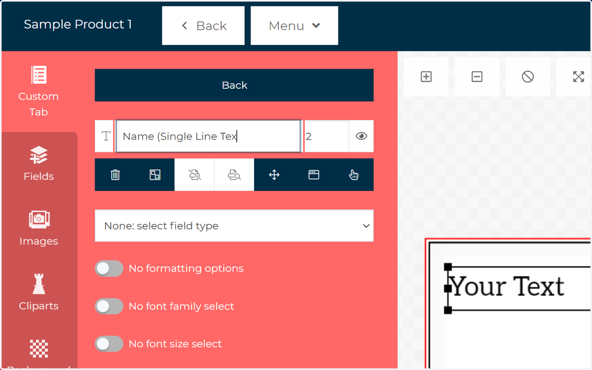
5. Specify the order in which the field will appear on the form
This works in relation to the number assigned to any other fields on your form. Lower numbers will appear further up the form.
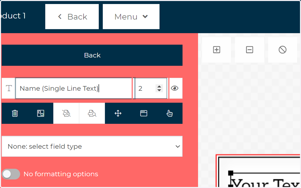
6. Click this icon to control whether this field is displayed or hidden on the canvas
This is great if you've already fully defined a field so don't want to delete it, but don't want it on the canvas at the moment.
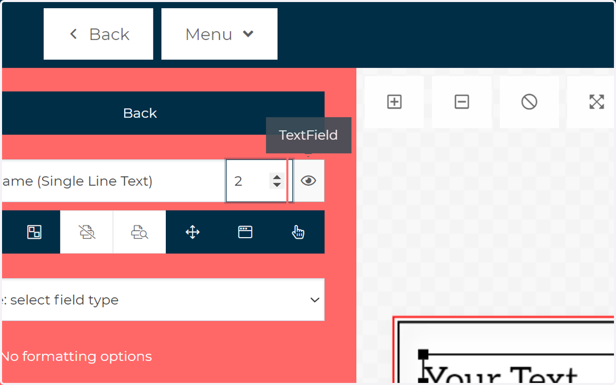
7. Specify Interactivity options
This set of options controls the primary ways in which your customers can interact with this field. You can control behaviour such as their ability to delete or reposition this field, along with controlling whether they can open the configuration pop up.
Remember, this is only a sample of the most commonly used interactivity options. More detailed options can be located on the pop-up. Double click the field and head to the Details tab.
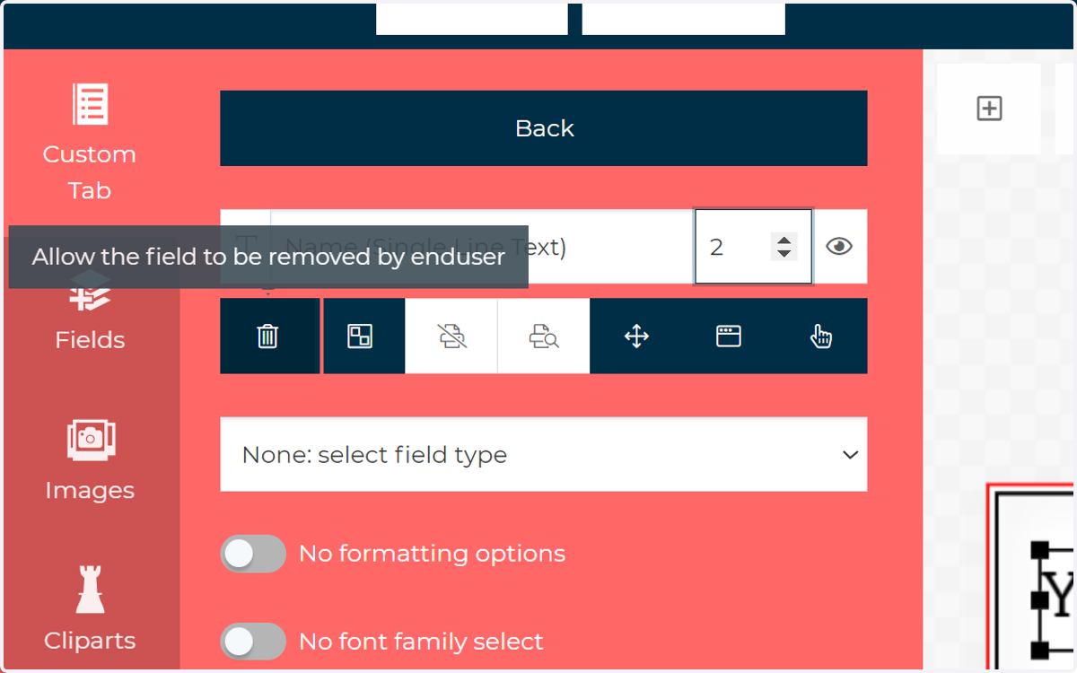
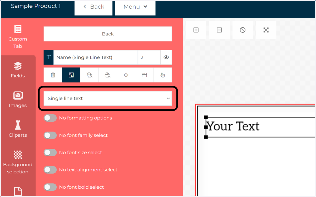
8. Select the required content format for this text box from the dropdown.
You have a selection of multiple format types, depending on what you wish the contents of the text field to be. We'll cover many of these in later tutorials.
For now, we'll stick with the basics and select a Single Line Text.
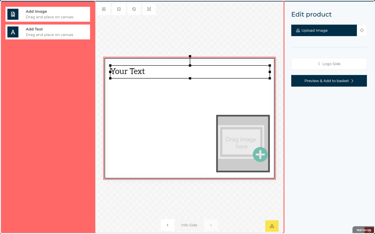
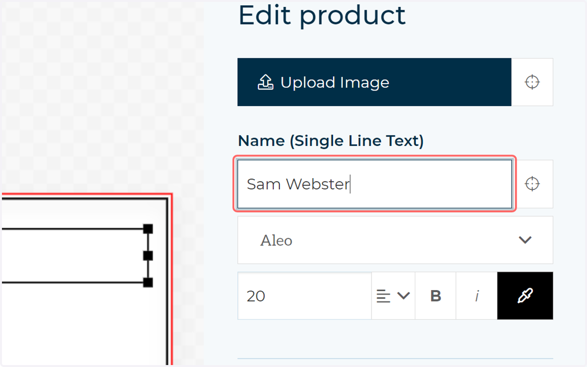
9. Your text field on the form is ready to go. Input some text and it will also be placed on the canvas
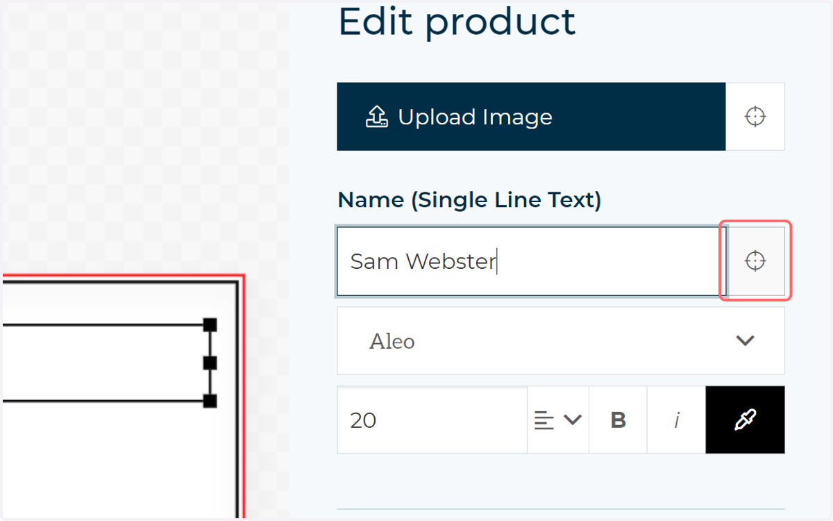
10. If you have a lot of fields on your canvas, it may be difficult to spot the element this text field relates to. Click the target icon to snap the view to this field.
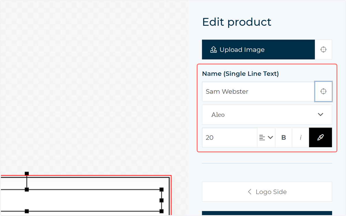
11. Formatting options are available by default
As you can see on the form, various formatting options for the field are enabled by default.
In our example we will remove these to prevent our customer from altering the format and only giving them the option to change the input text.
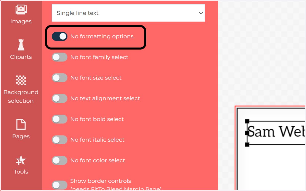
12. Check No formatting options
You can quick apply no formatting options with the "No formatting options" toggle. Alternatively, the toggles below this give you finer control over the formatting options to display on this particular field.
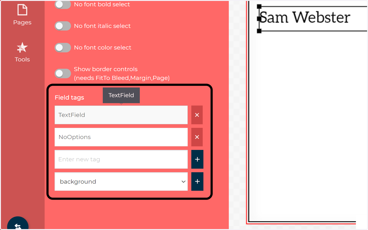
13. Field Tags
Once again, we see that when we change options on our form builder, configuration field tags are added and removed. New tags can be added manually if you already have a configuration in mind and know the tag(s) you require.
14. Further configuration options
Remember, not all configuration options are shown on the form builder. If you need to further configure or control interactivity with a field, double click on that field on the canvas and head to the Details tab.