[TUTORIAL] Boxes - Spotlight Carousel
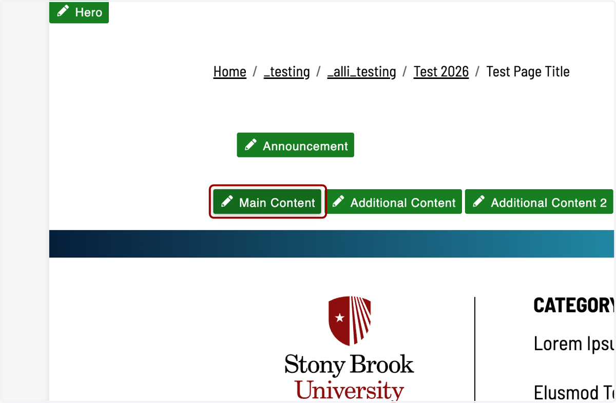
1. Click on the section you would like to add this component to. In this example, we will be inserting it into Main Content.
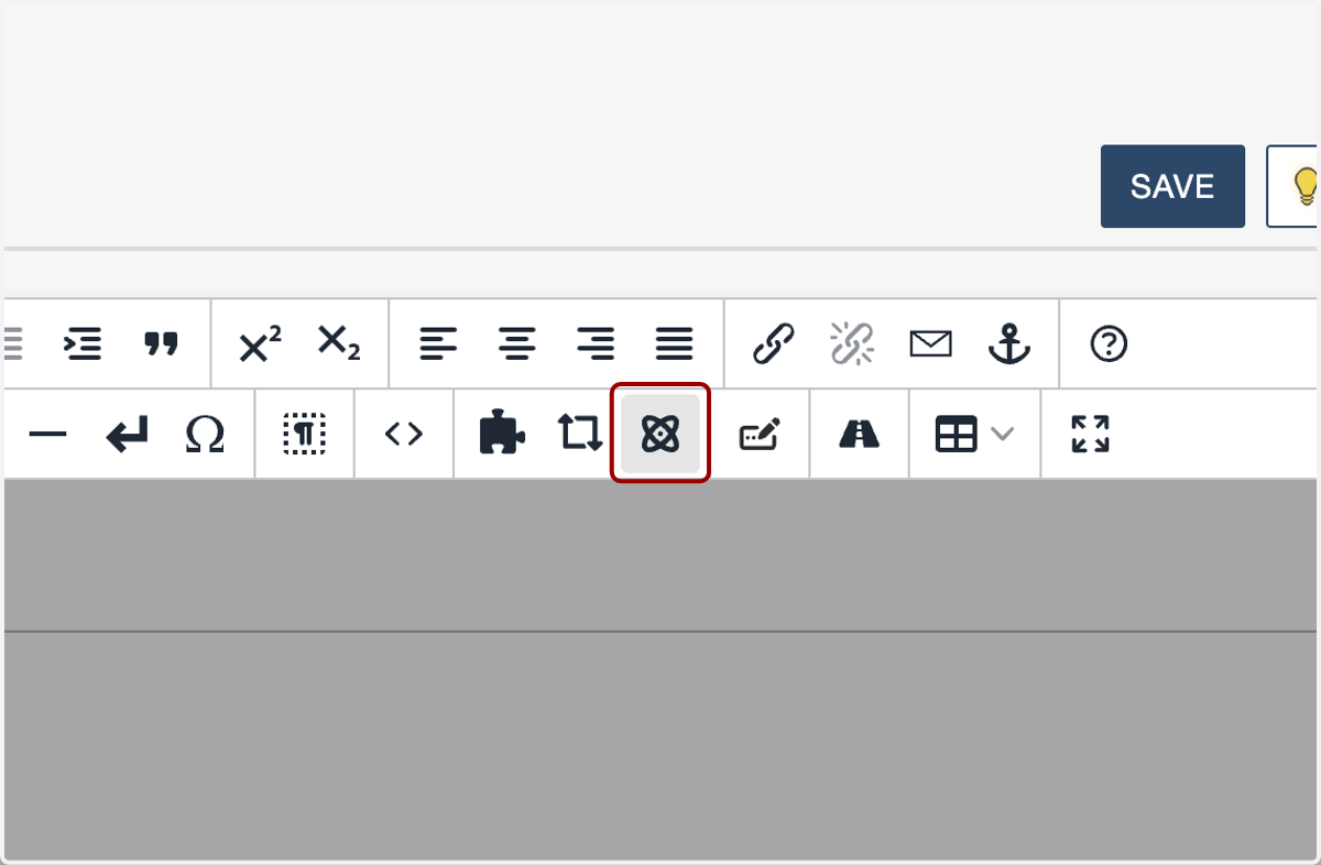
2. Next, click on the Insert Component icon.
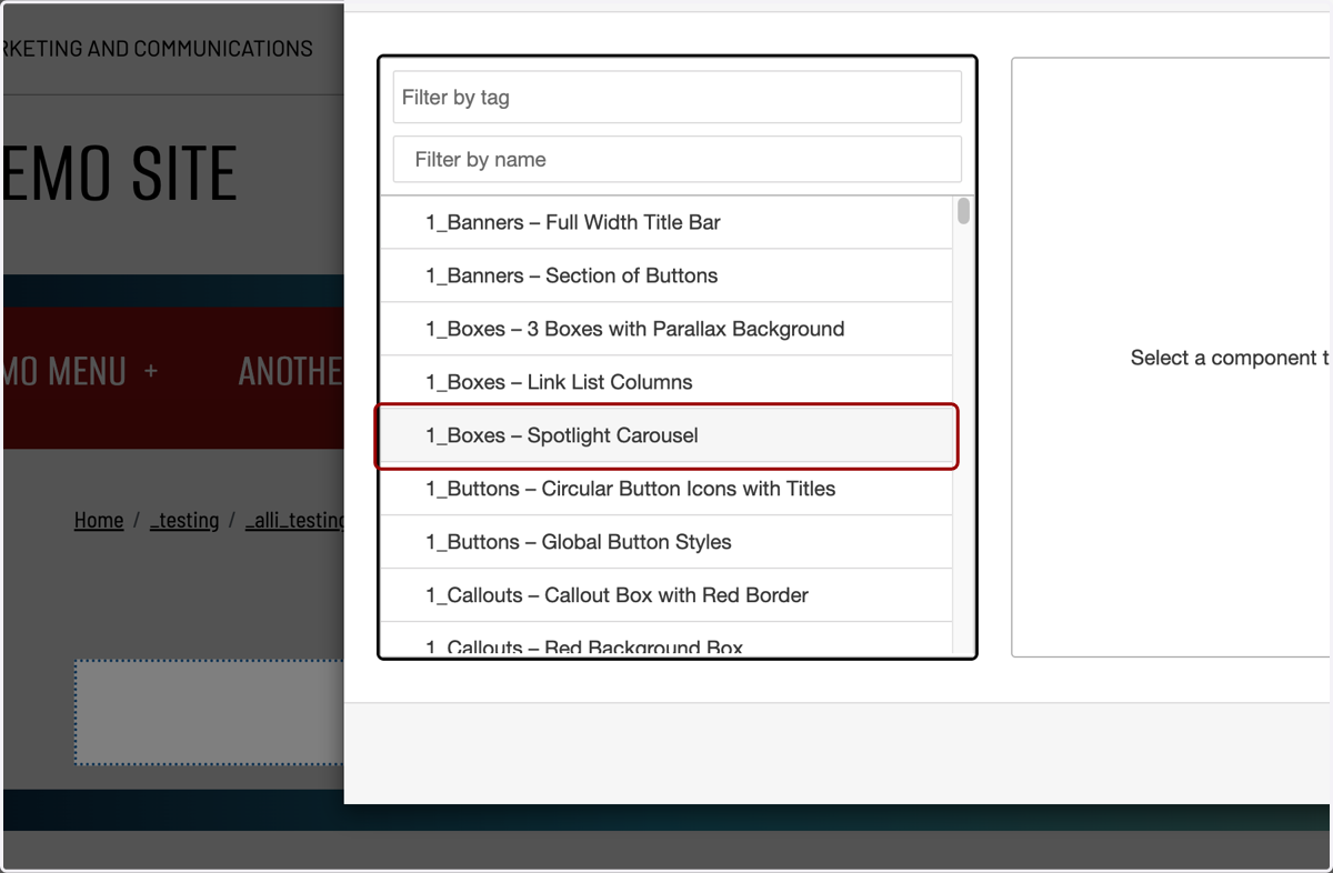
3. Click on or filter by name for the "1_Boxes – Spotlight Carousel." You will see a preview of it appear on the right-hand side.
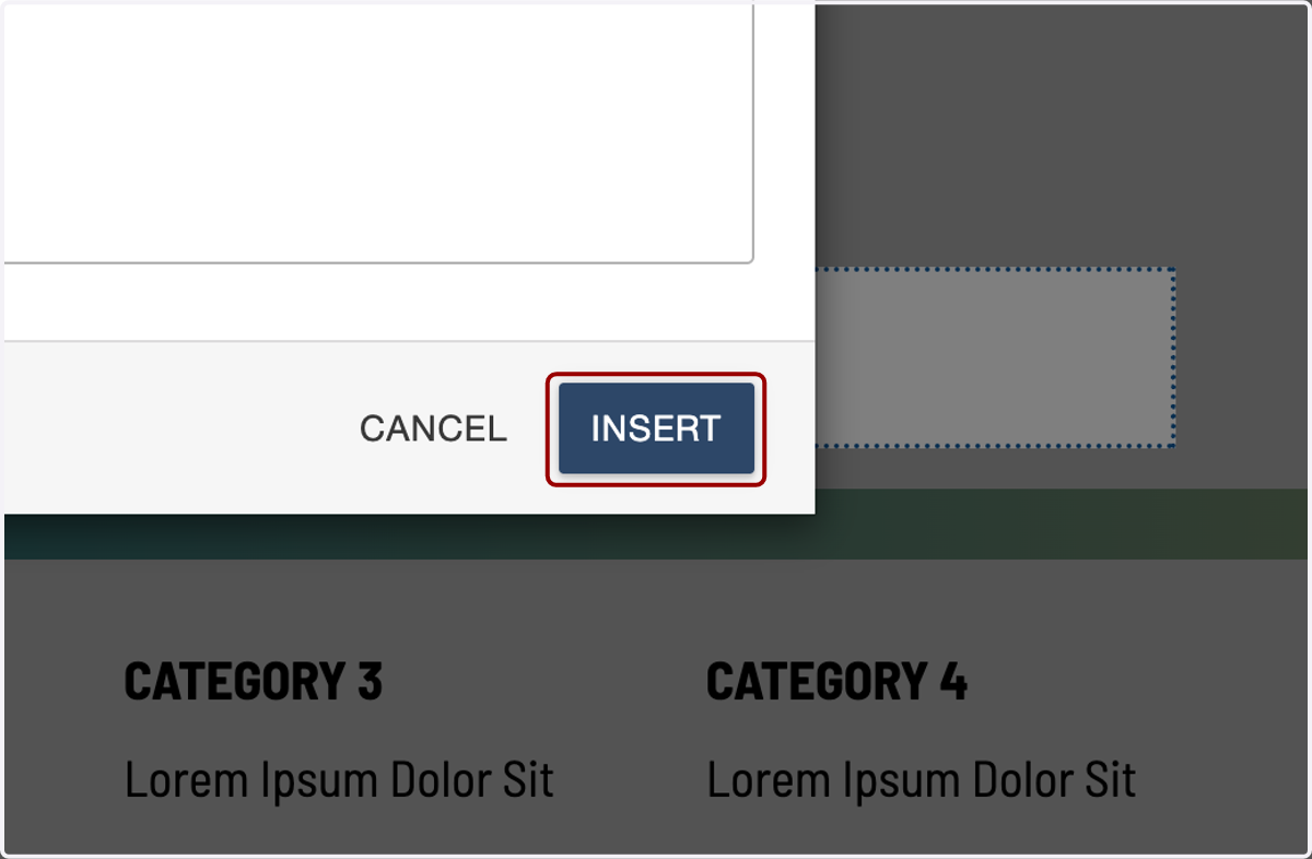
4. Next, click the Insert button.
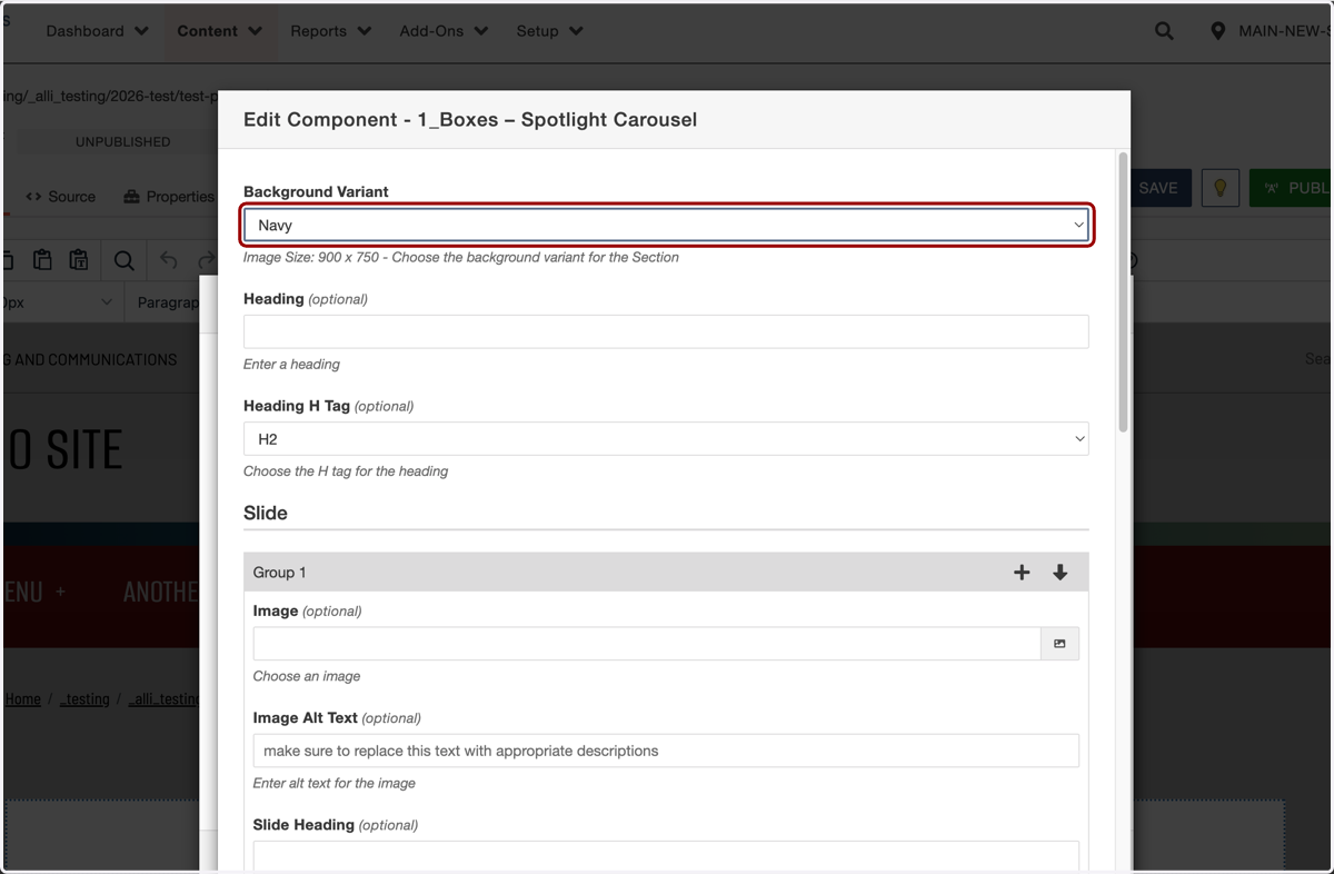
5. This component has a variety of color choices for the background. You can see demos of each available background variant in the Demos section below. We will be using the navy background for this example.
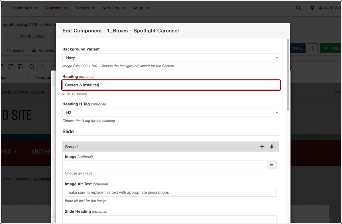
6. If you add a heading to this section, it will appear above the carousel boxes.
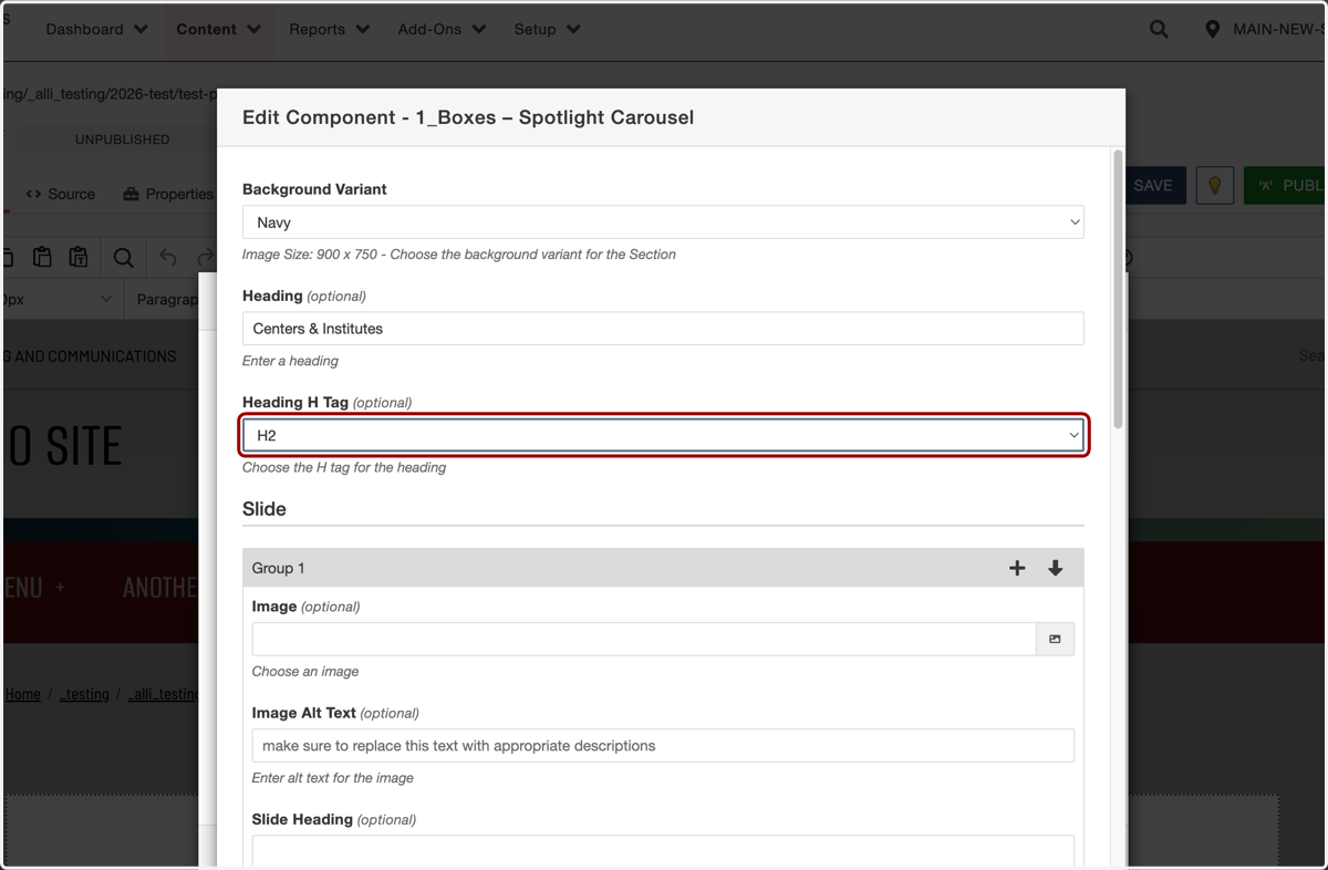
7. Next, you'll select the heading H tag you would like to assign that headline. Unless you are using this section as the hero of your page (which is unlikely) you will probably want to keep this as the default H2.
For more information about when to use different H tags, see our other help guides.
8. We will now begin filling out the scrolling boxes inside this carousel. First, choose an image to populate the right-hand side of the box. You'll want to use a 888 × 756 pixel image.
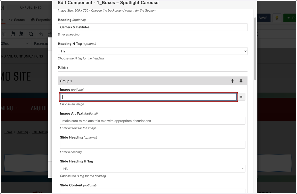
9. In this example, we'll click on the image chooser...
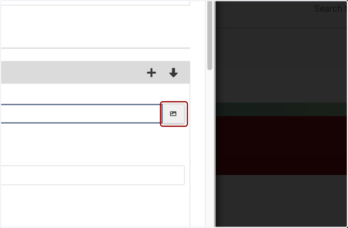
10. ...then navigate to an image we already uploaded to the website. If you need to learn more about how to upload images, please see our other help guides.
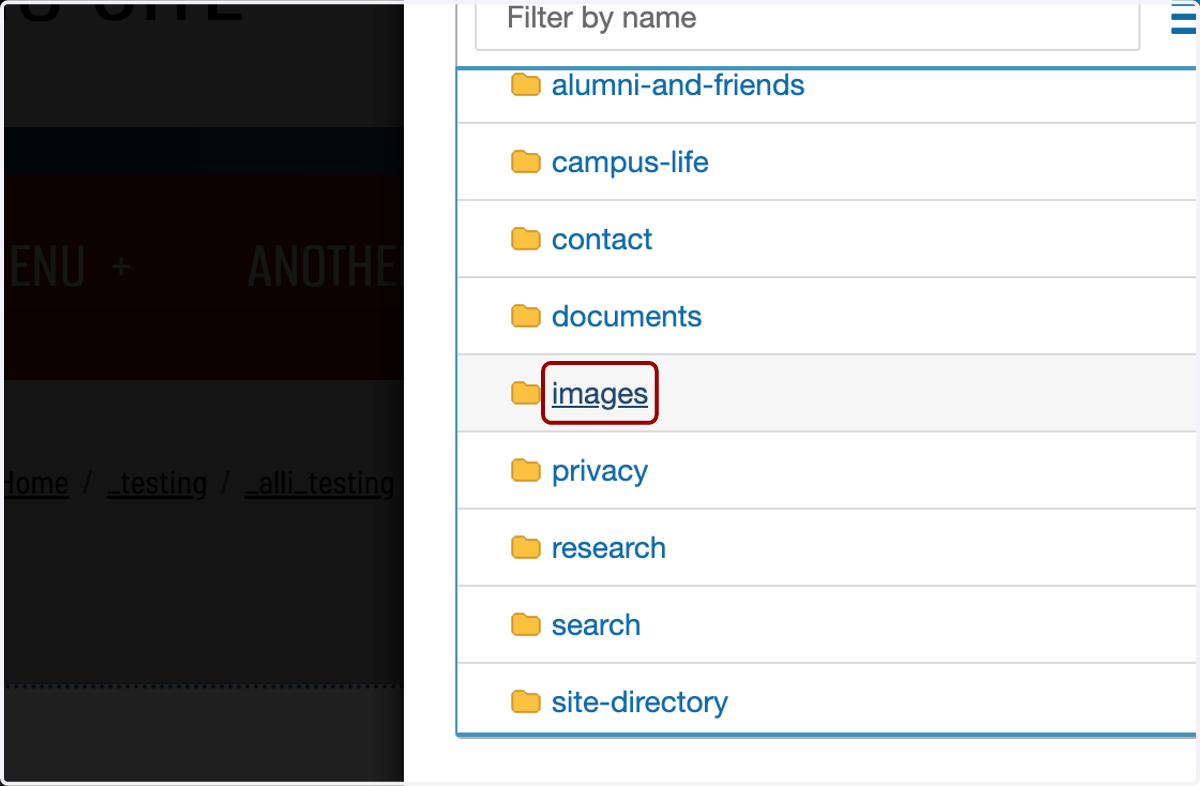
11. Here is the image we will use in this example.
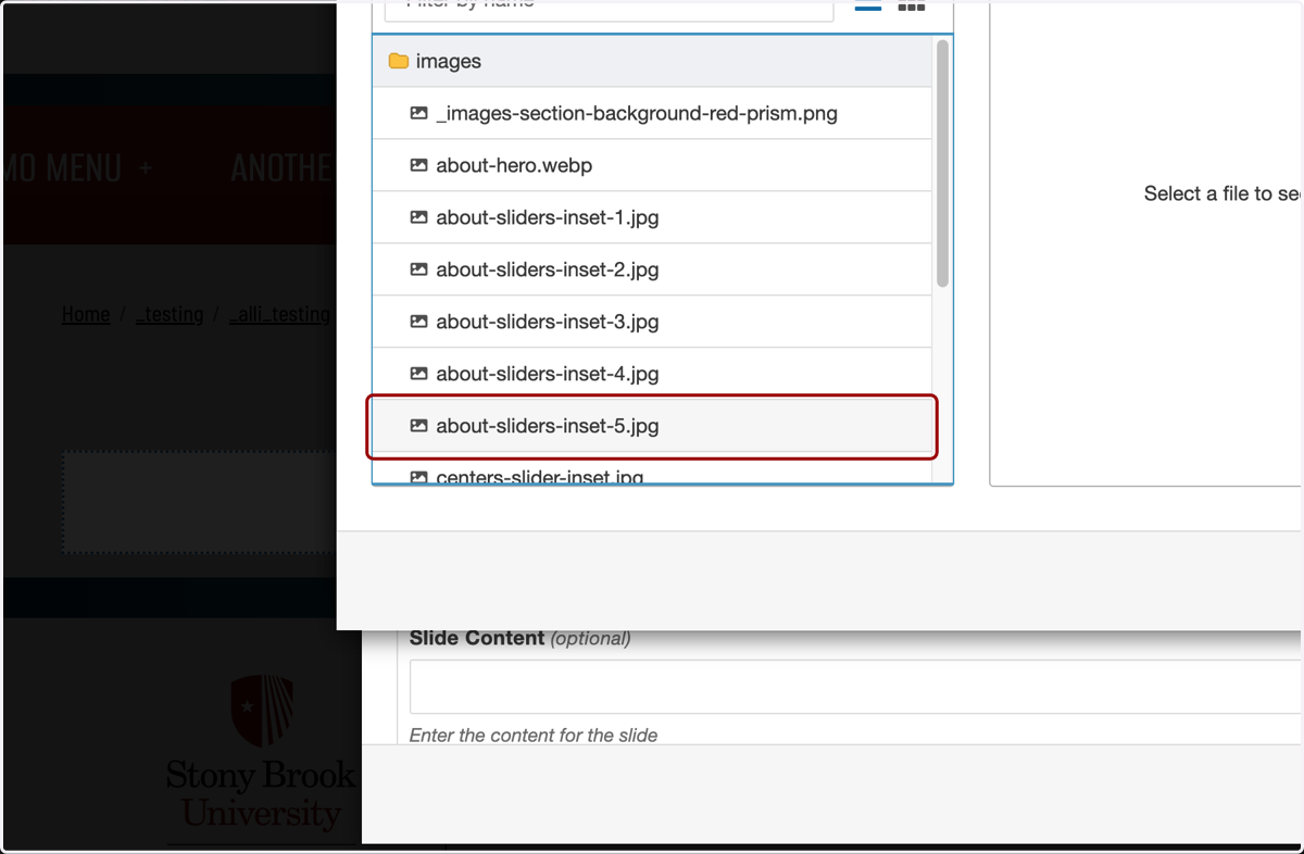
12. Click the Insert button.
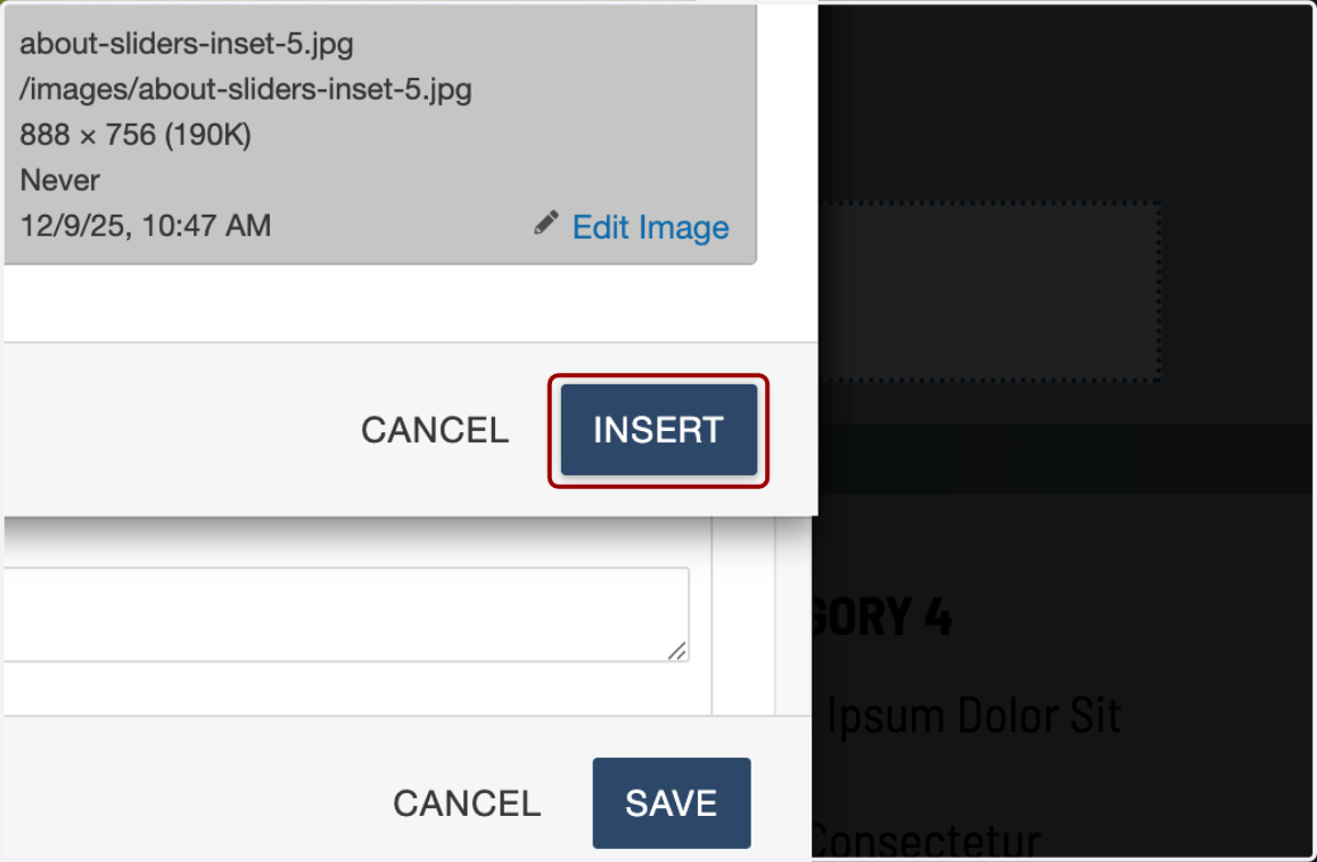
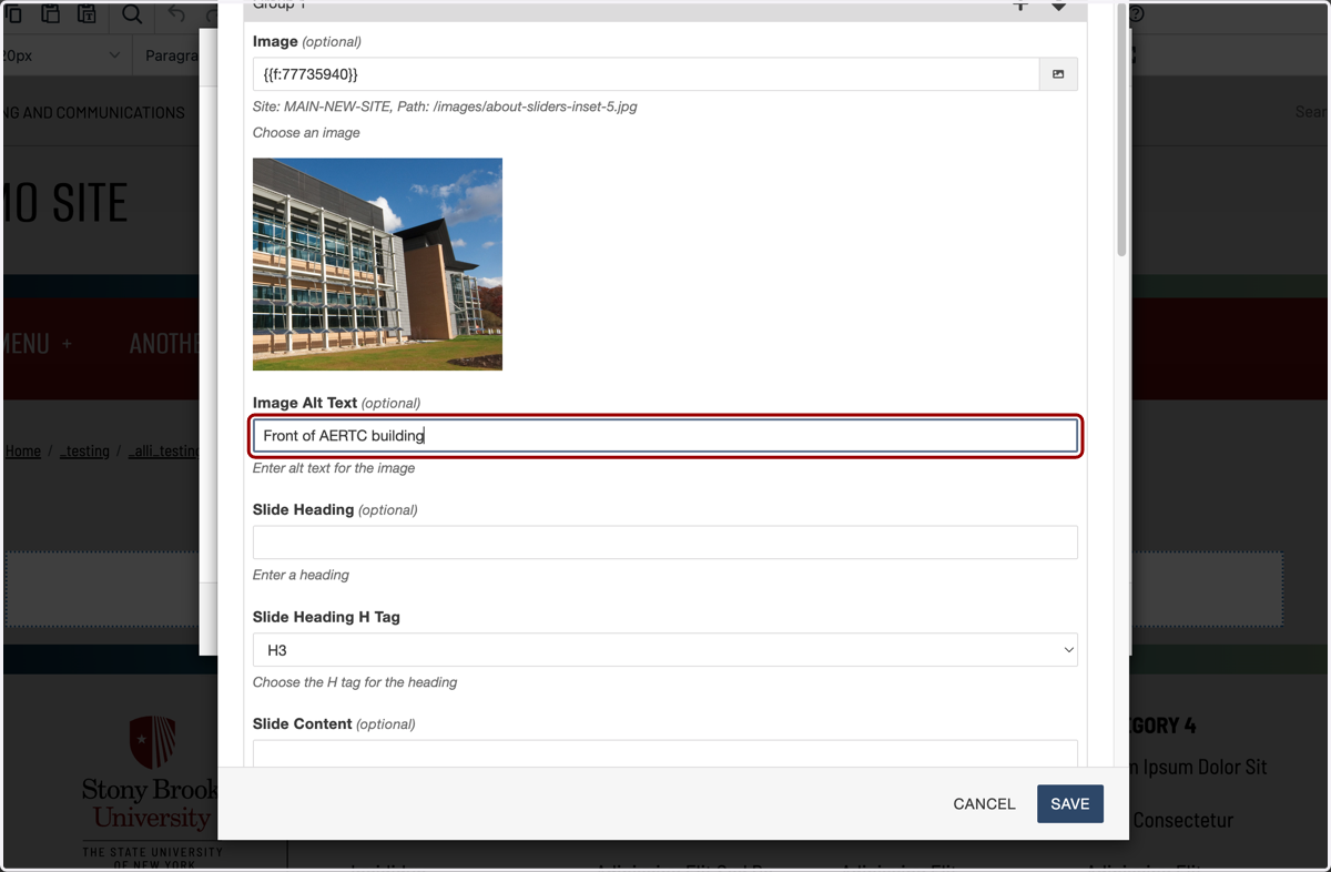
13. ...and then add the alt text that describes this image. This should briefly describe the image's essential content and purpose that a user needs to know if they aren't able to see it.
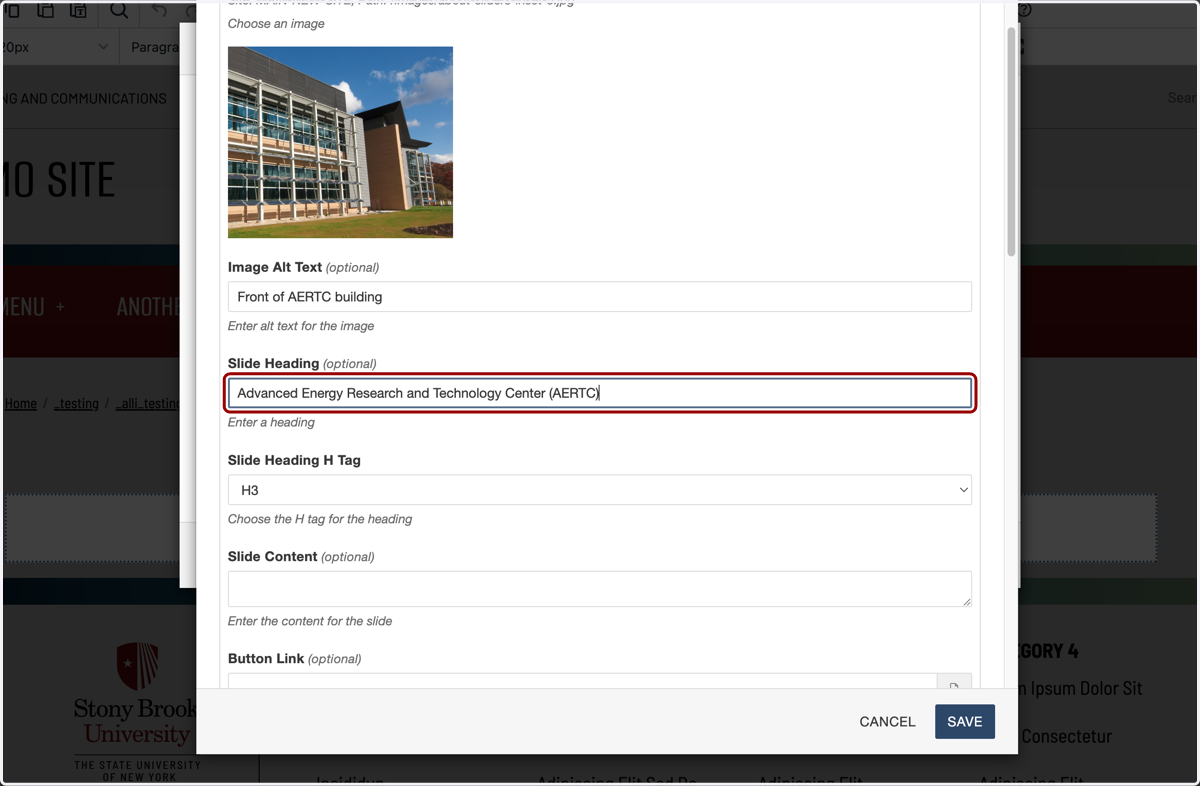
14. The Slide Heading is the headline for this particular carousel slide.
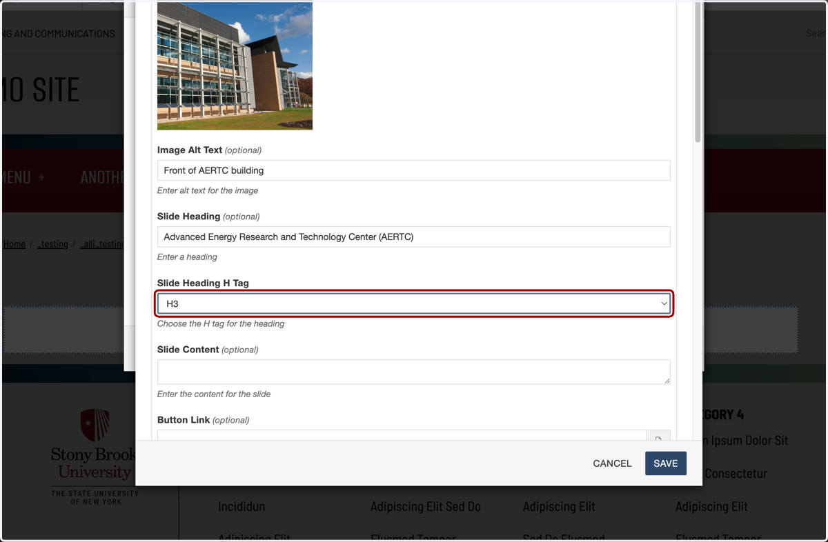
15. Here is where you will set the H tag for this headline. Again, you will more than likely want to keep this Slide Heading H Tag as the default H3, especially if you selected H2 for the headline earlier.
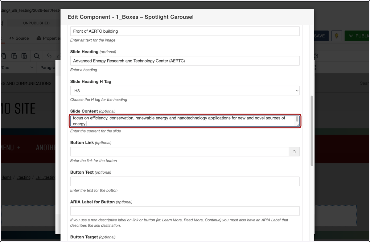
16. Next, we will paste in our Slide Content, which supports what we wrote in our headline.
[PASTE: The Advanced Energy Center is a partnership of academic institutions, research institutions, energy providers and industrial corporations. Together they pursue pioneering energy research and deploy education and technology with a focus on efficiency, conservation, renewable energy and nanotechnology applications for new and novel sources of energy.]
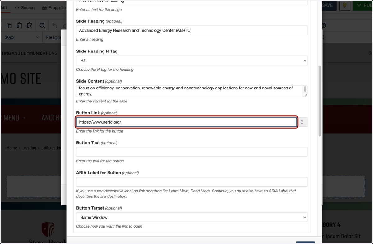
17. Next is the Button Link. Here, you can use the file chooser to select a page on stonybrook.edu, or paste an external URL into the field.
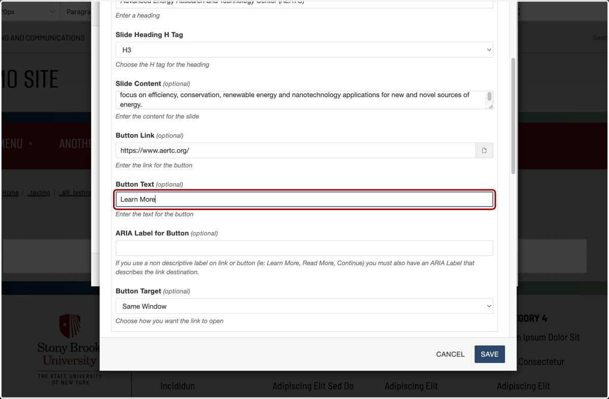
18. Now add a call to action for the button in the Button Text field. We'll enter "Learn More" for this example.
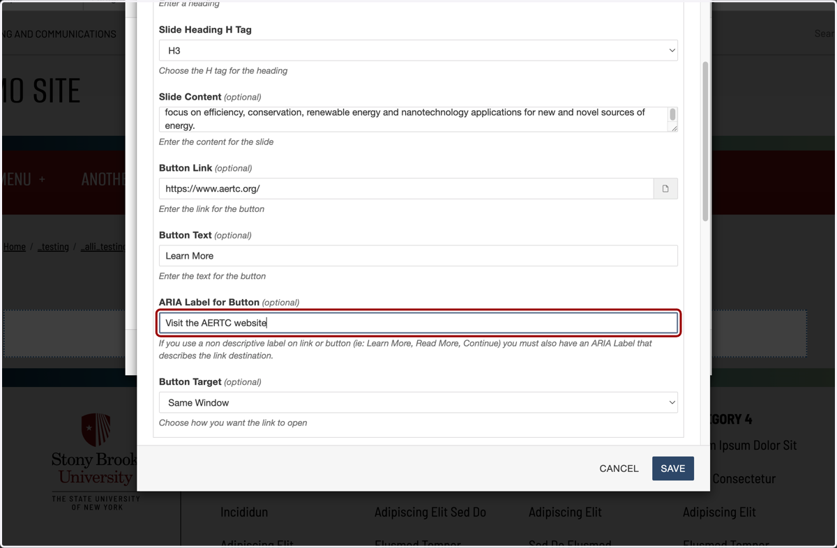
19. "Learn More" as a button is not accessibility-friendly on its own because it lacks context for screen reader users, so we will need a descriptive ARIA label that clearly explains what the user will learn or where the action will take them.
20. You have the option to have this link open in the current window or a new one. Because our example goes to an external website, we'll select New Window here, but you can set the target however you would like.
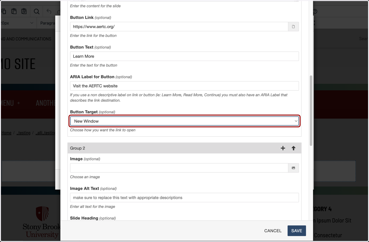
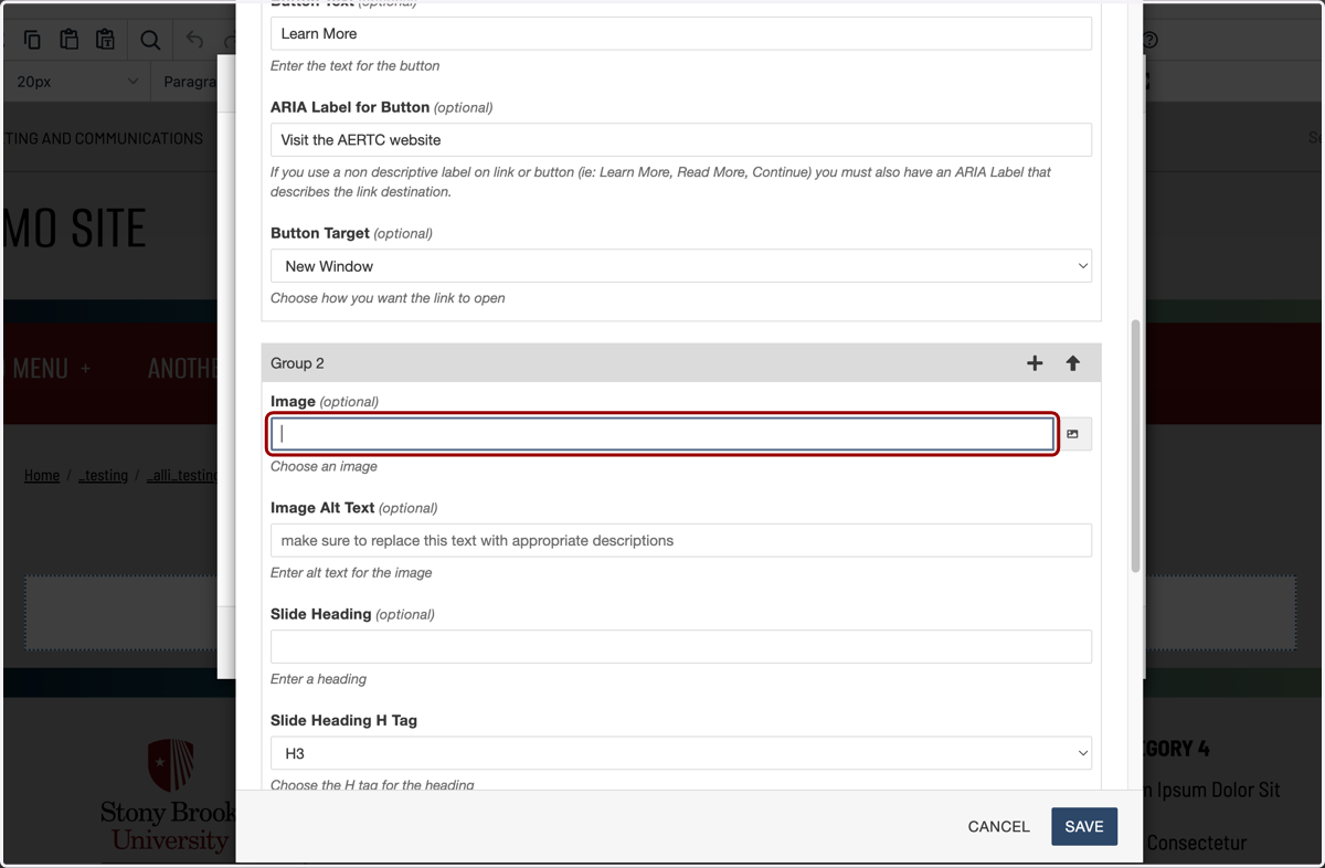
21. That completes the first card in the carousel. Repeat the same steps from "Group 1" in "Group 2" for your second card.
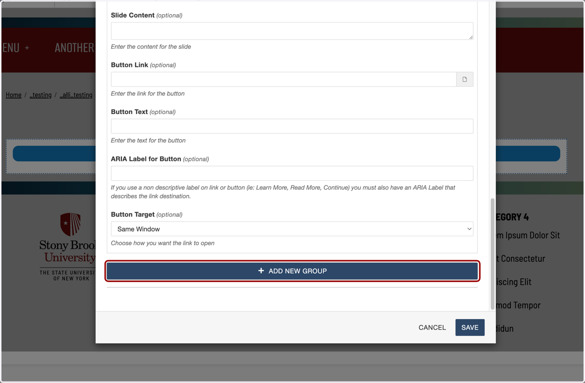
22. To add more cards, you can click "ADD NEW GROUP" and add as many cards as you would like. We recommend keeping this under a handful of cards for ease of use for visitors.
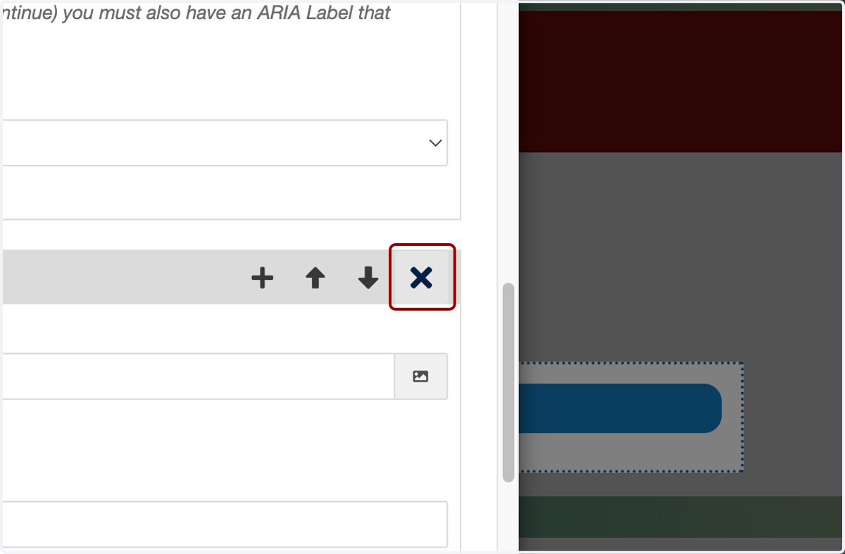
23. You can also rearrange cards with up and down arrows once you have a few set up.
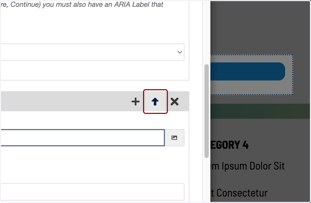
24. You can add...
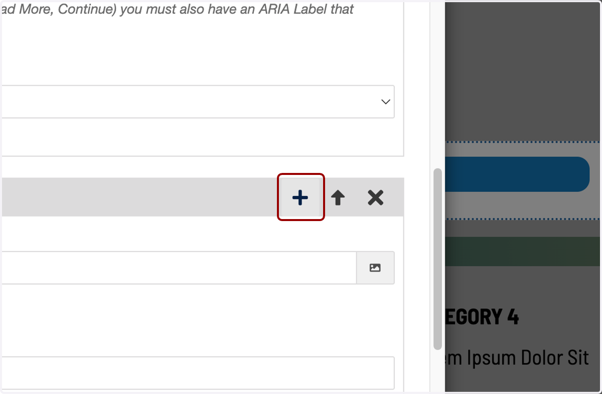
25. ...or delete cards as well.
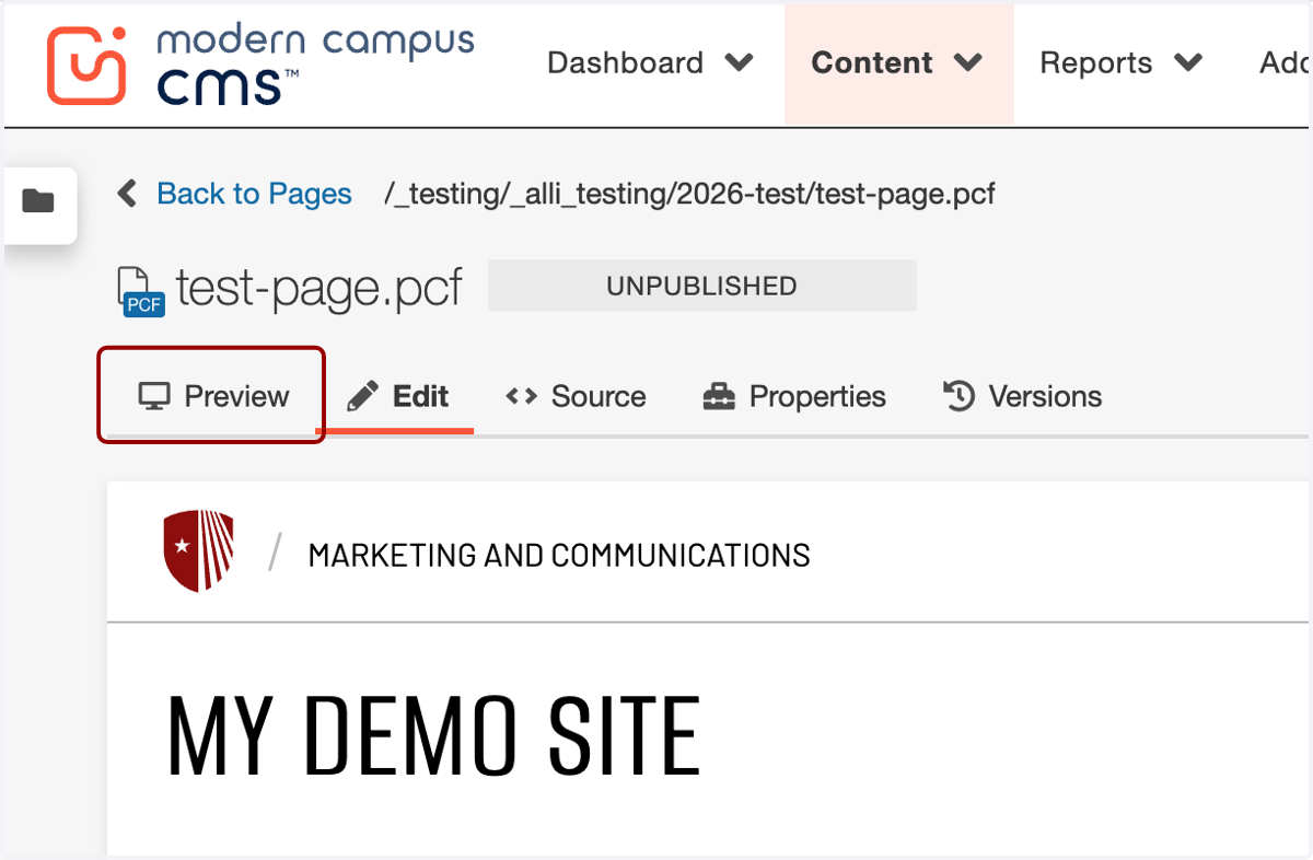
26. When you're done, click "Save" to preview your work.
27. Hit SAVE on the top of the page...
28. ...then the preview tab to check your work and make sure your cards are set up properly.