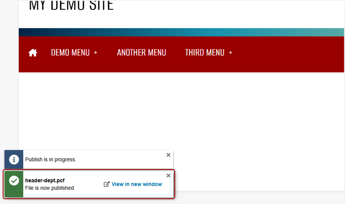
[TUTORIAL] Header Config: Setting Up the Top Nav Menus
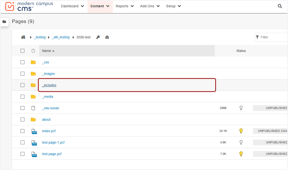
1. You can find the nav menu by going to the _includes folder in the root of your site...
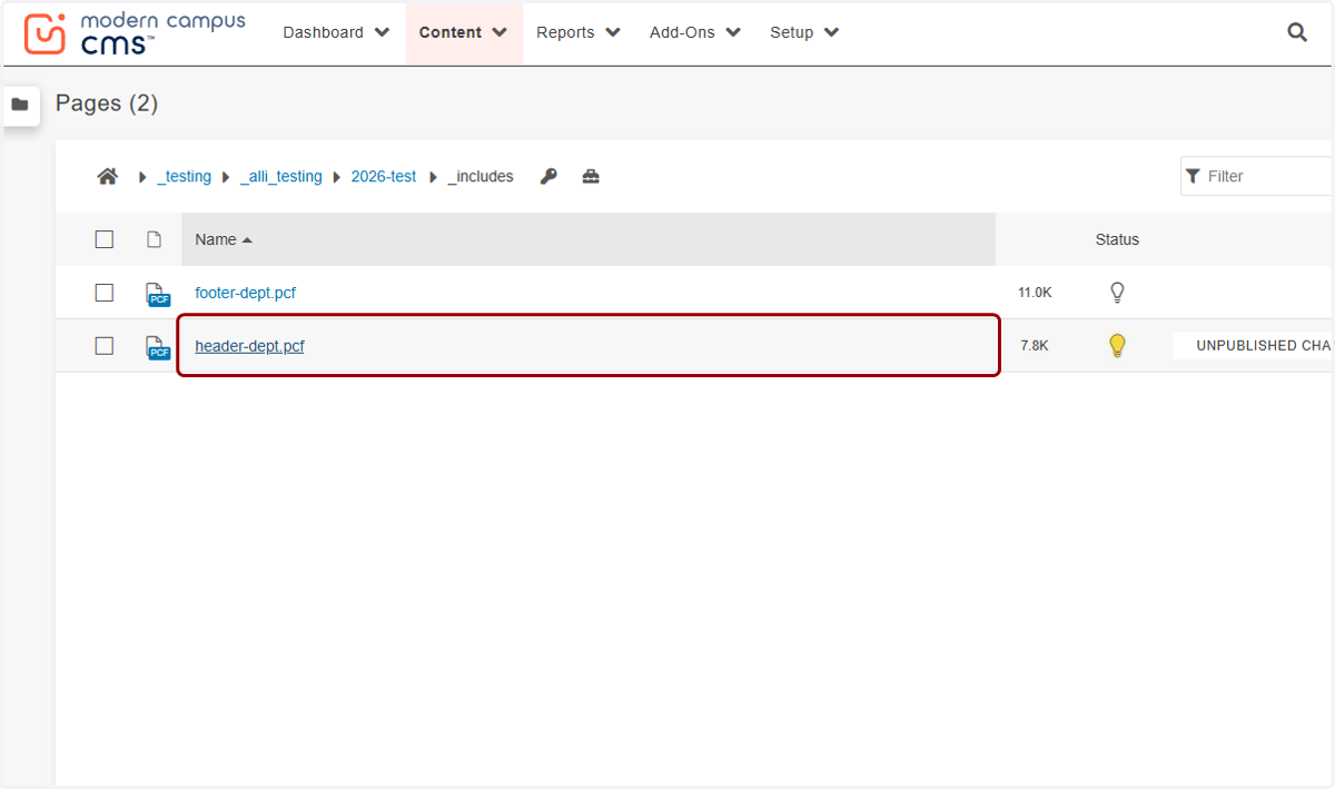
2. ...and clicking on header-dept.pcf.
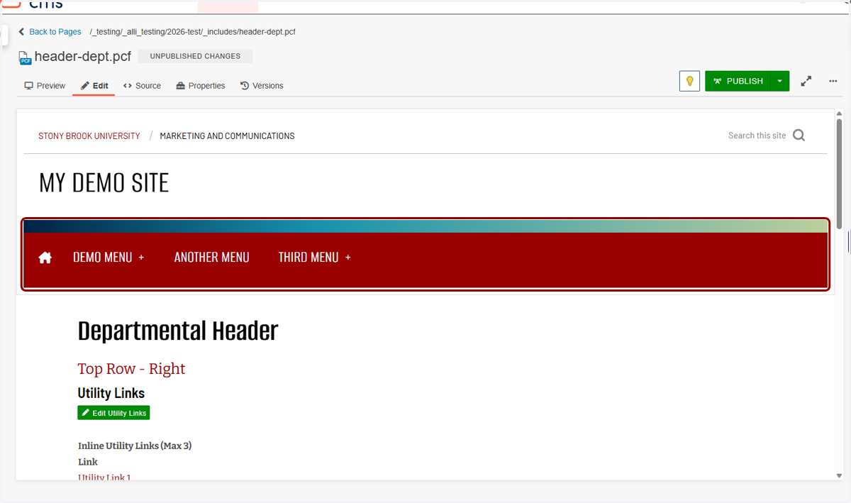
3. You'll see your website header, then a list of the different links in the main content section below.
4. We'll work on the Utility Links first. You can turn these links on or off in the Properties tab.
We have instructions on how to manage the header properties in a separate video, so be sure to check that out at stonybrook.edu/websupport if you need. In this example, we have the Utility Links already set to display.
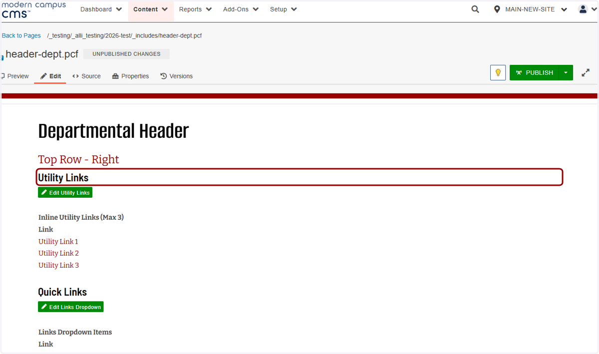
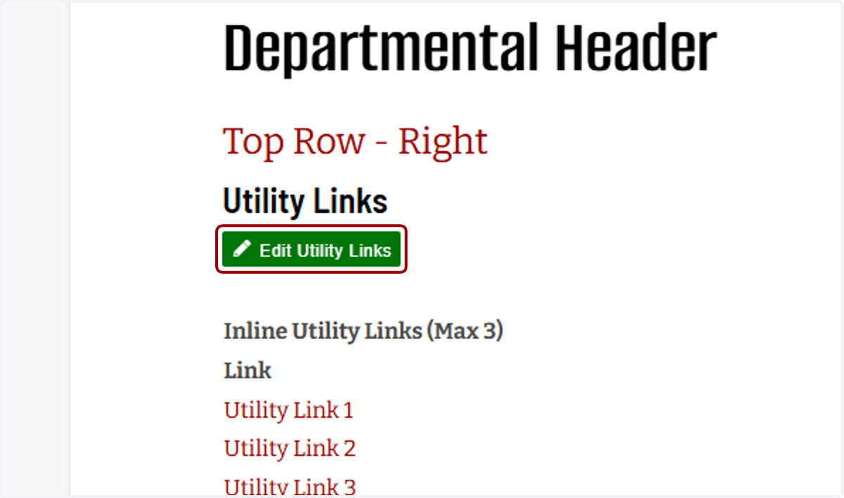
5. I'll click on Edit Utility Links...
6. ...and I'm taken to a WYSIWYG where I can fill in each link in separate cells.
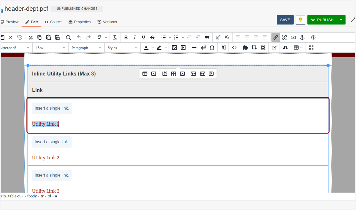
7. These links work like any others in Modern Campus. You can title them anything you want, like "Utility Link 1" here...
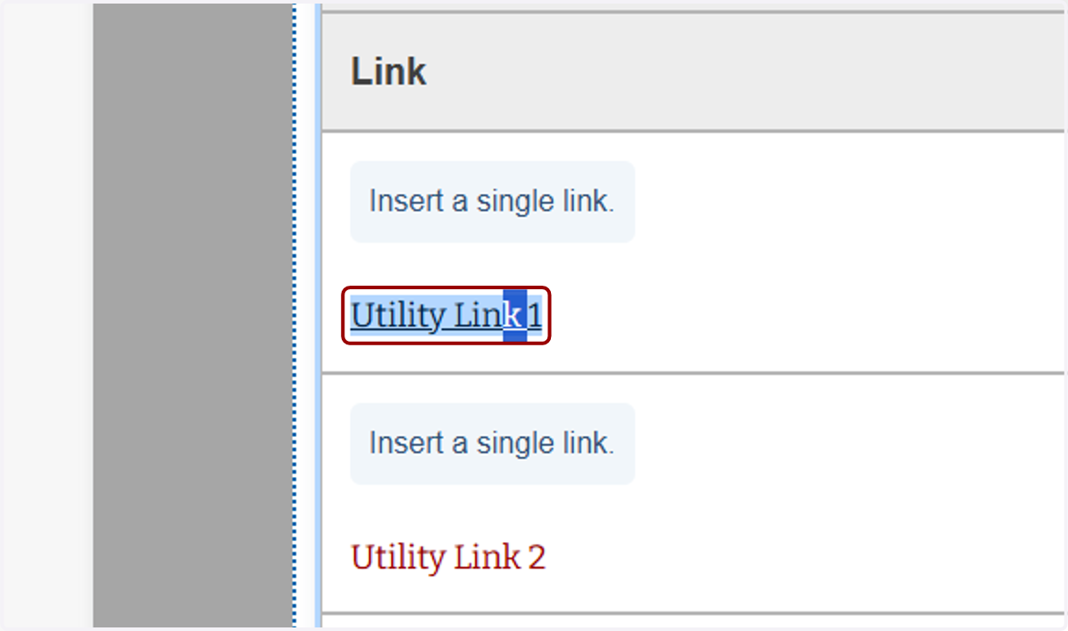
8. ...highlight the text...
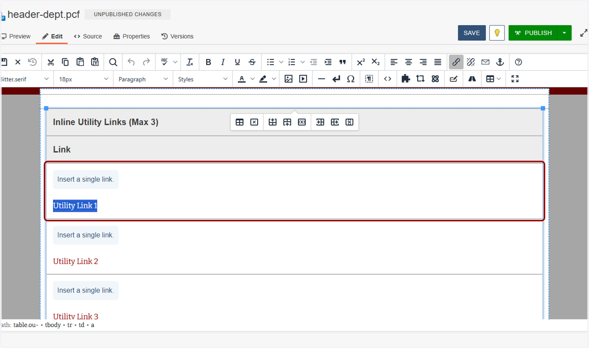
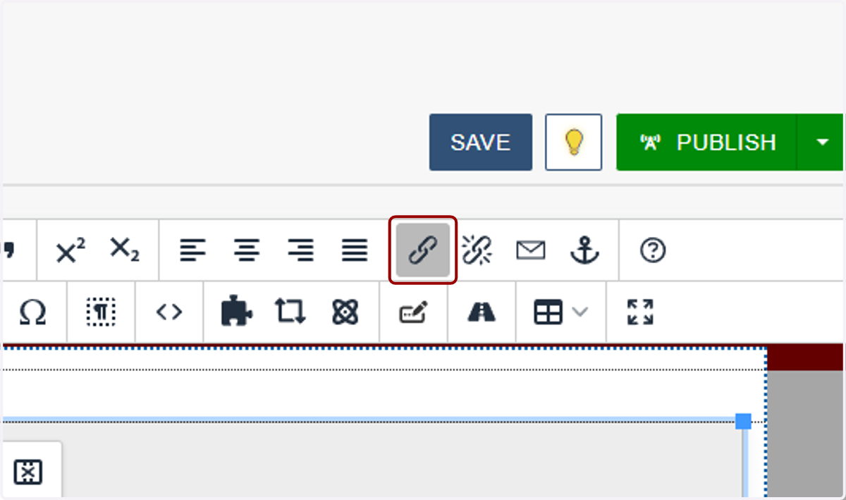
9. ...and click on the link button in the toolbar.
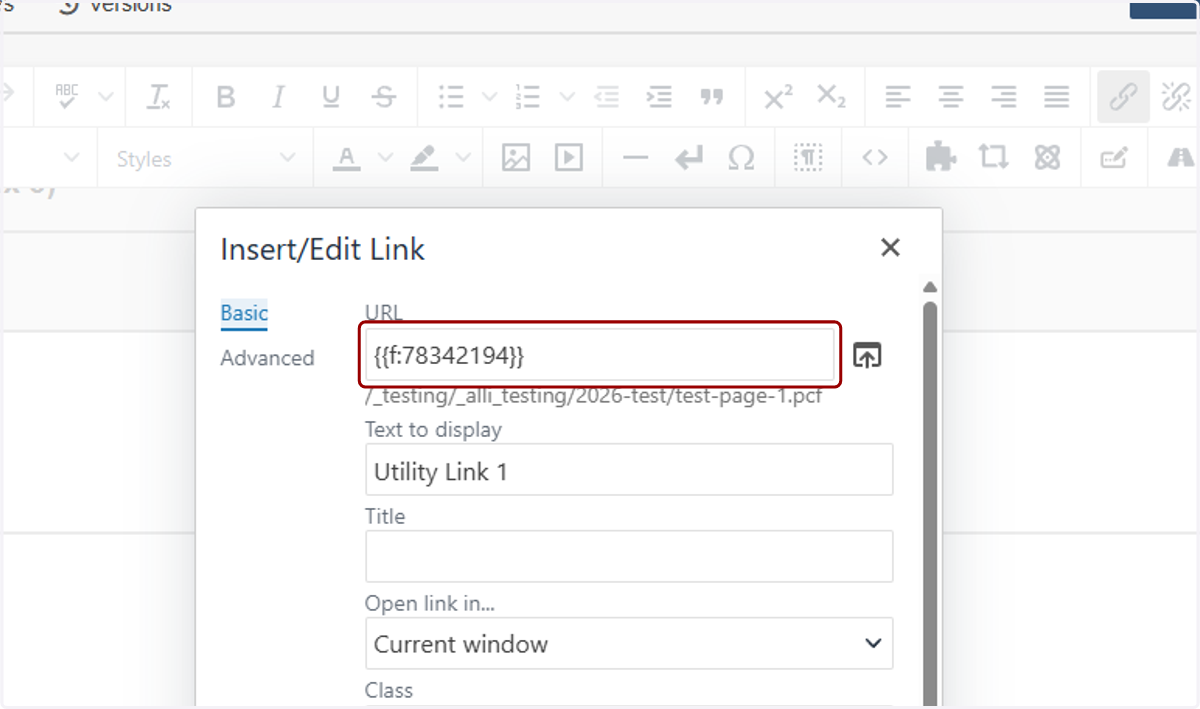
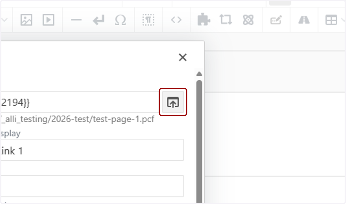
10. Either paste a link into the URL field or use the file chooser to select a page on stonybrook.edu.
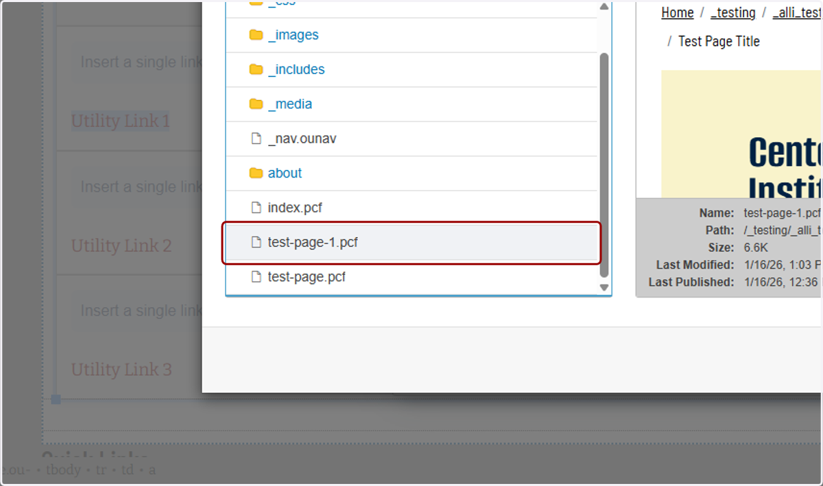
11. I'll use the file chooser to select another test page on my site as an example.
12. Here is the page I want to use.
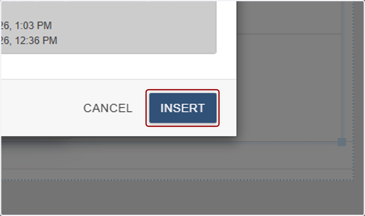
13. I'll click insert...
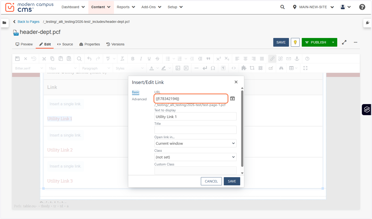
14. ...and you'll see the dependency tag in the URL field.
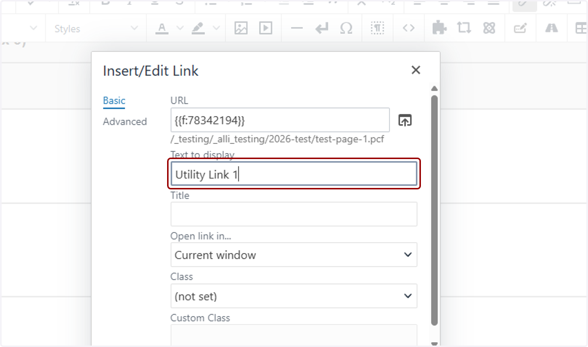
15. The Text to display is the anchor text we typed out in the WYSIWYG.
16. The Title field is next, and you will most likely always leave this blank. The Title field sets the link’s HTML title attribute, which appears as a hover tooltip and can provide extra context.
It isn’t visible on the page, isn’t required for accessibility, and shouldn’t replace clear link text. Leave it blank unless you need brief, non-redundant clarification of what the link goes to.
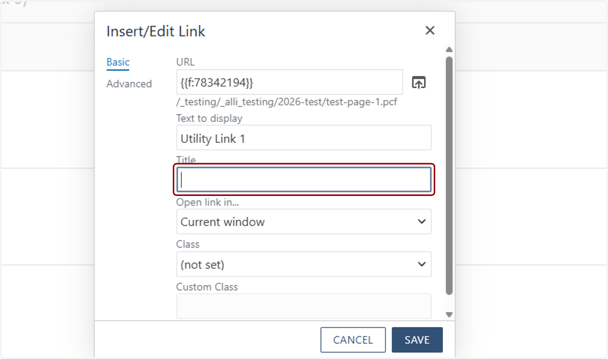
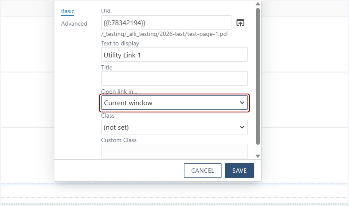
17. I have the option to have this link open in the current window or a new one. Because this goes another page on my site, I'll select Current Window here, but you can set the target however you would like. You can ignore Class and Custom Class fields.
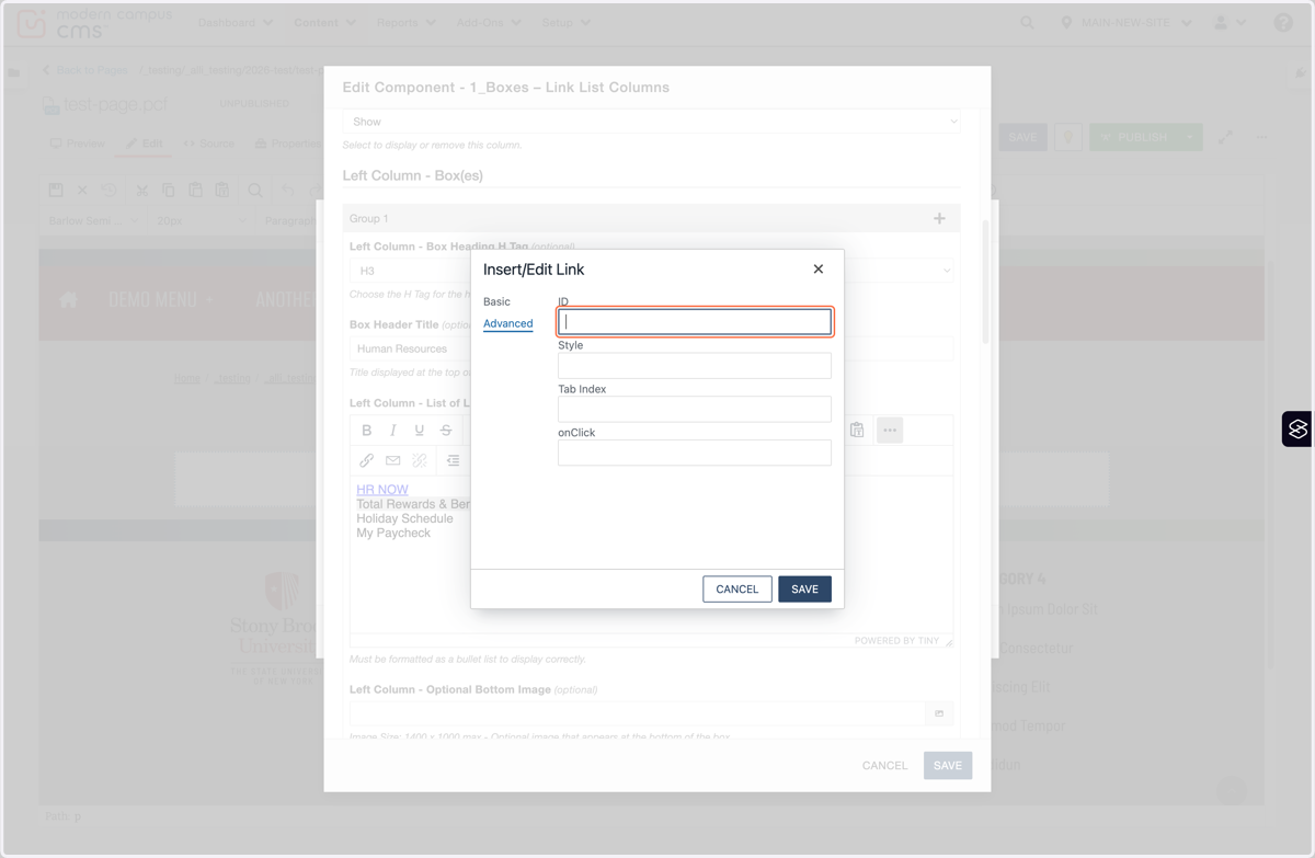
18. You may also notice there's an Advanced tab in this window. These Advanced fields control technical behavior, not content. ID is for anchoring, scripting, or analytics; Style applies inline CSS; Tab Index controls keyboard focus order; onClick runs JavaScript on click.
For most pages, you'll leave these blank unless you have a specific accessibility, tracking, or scripting need. Reach out to the MARCOM Web Services Team if you need more details on these.
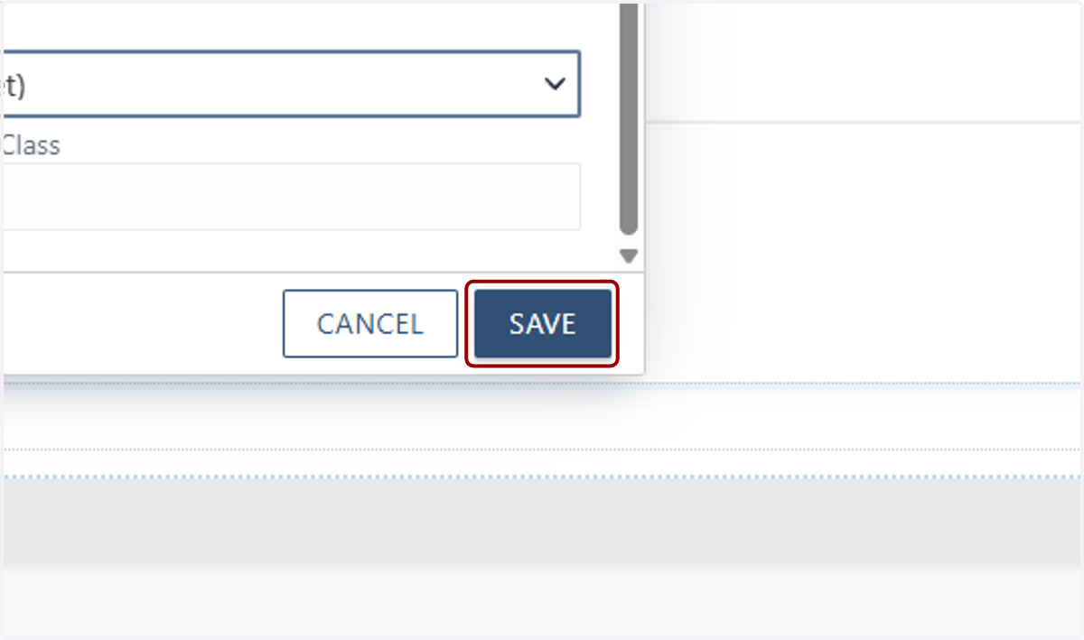
19. Click on SAVE.
20. We completed our first link! Repeat the same steps for the other Utility Links you want to add, then click Save at the top of the page.
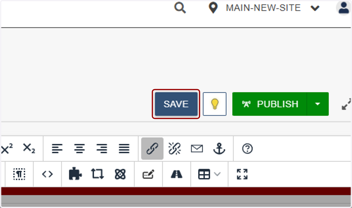
21. Next, we'll configure our Quick Links.
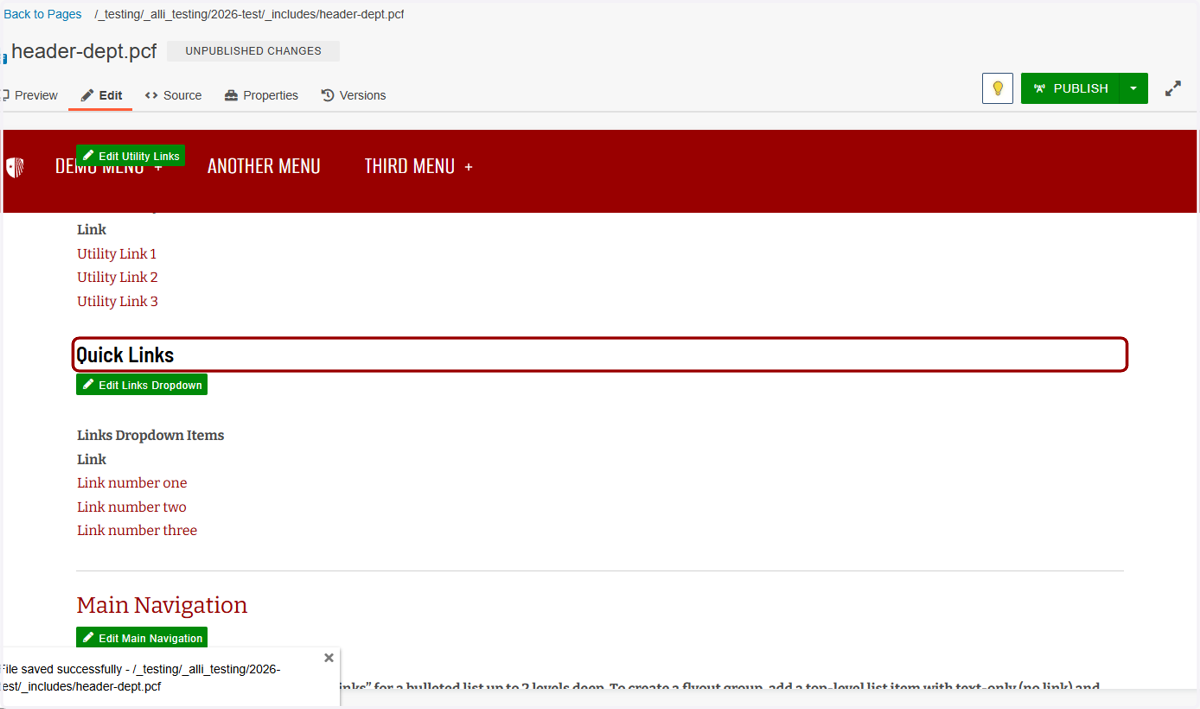
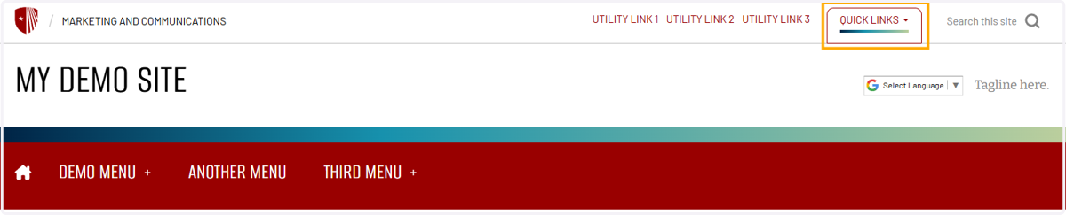
22. These links are a dropdown in the Utility row. You can switch "Quick Links" to another label in Header properties, which we cover in another article.
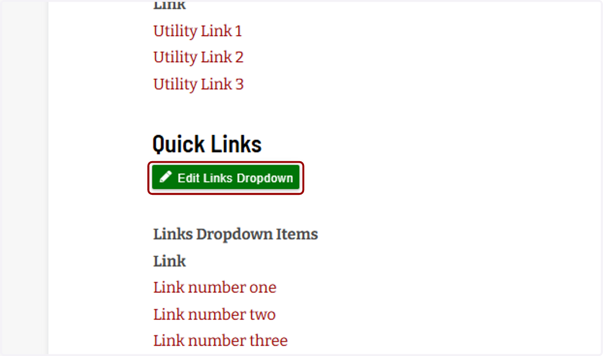
23. You configure the links that appear in the dropdown in the main content section by clicking the "Edit Links Dropdown" button.
24. These links work the same way as the Utility Links. I set my anchor text...
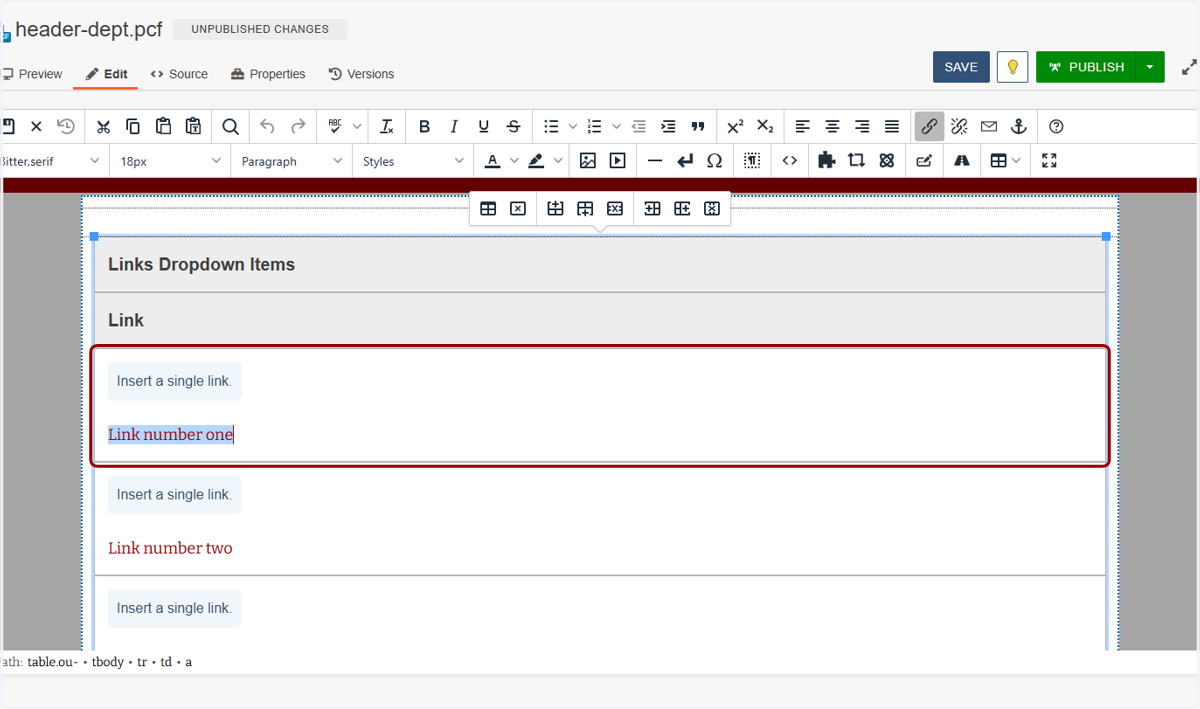
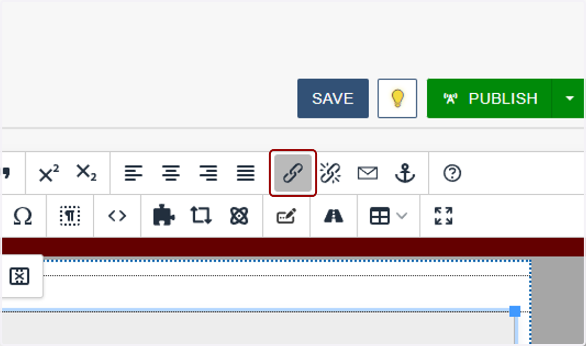
25. ...then highlight it and hit the link icon...
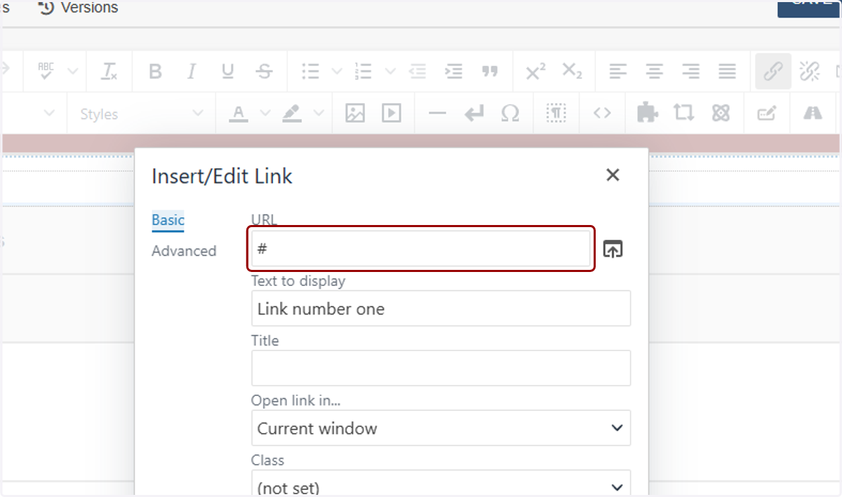
26. ...and place my link. I'll type a hashtag as a placeholder for now.
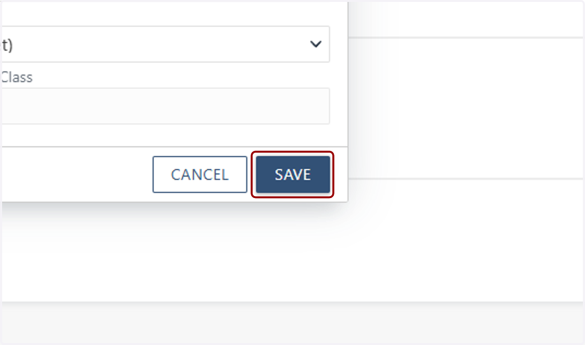
27. Then I'll click Save. Repeat this for however many Quick Links you would like to add.
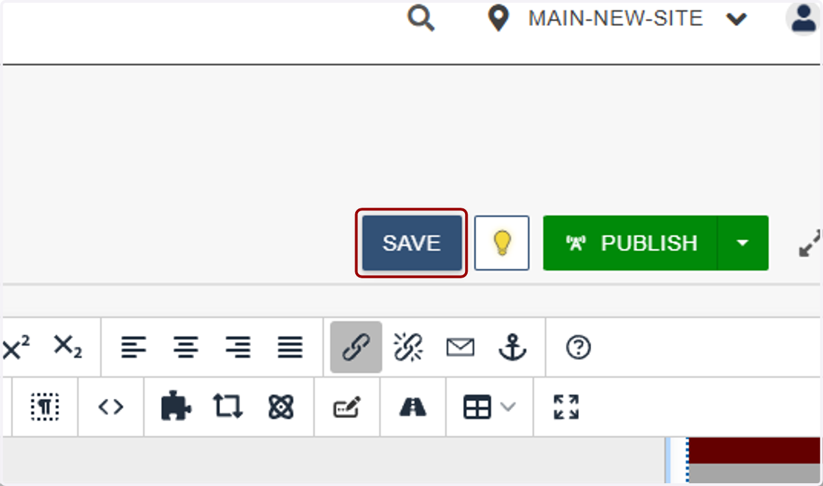
28. I'll click Save at the top of the page to save what I've done so far.
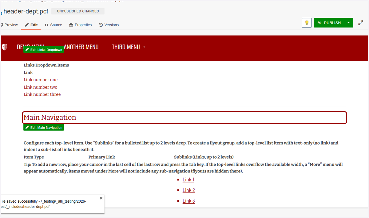
29. Now we'll work on the Main Navigation. This is where you'll manage the links in the red bar, like Demo Menu, Another Menu, and Third Menu in this screenshot.
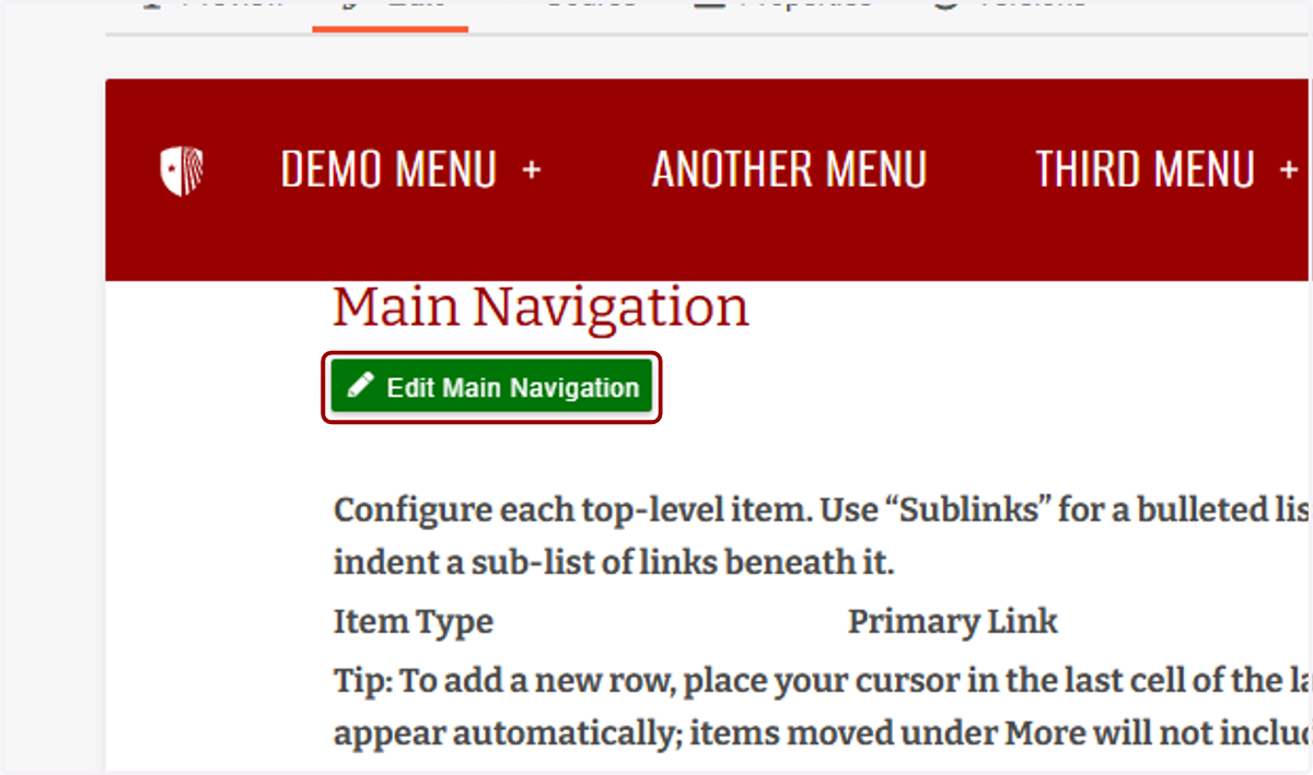
30. To edit this section, click "Edit Main Navigation."
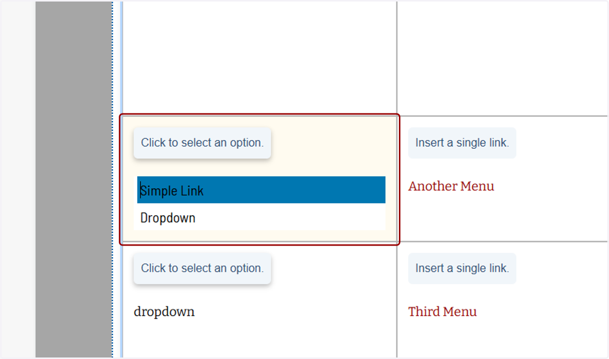
31. Each menu option can be a simple link or a dropdown. A simple link will display in the red bar and not have a + icon next to it, while a dropdown will have a + and drop down to show more links when hovered over on desktop or tapped on mobile.
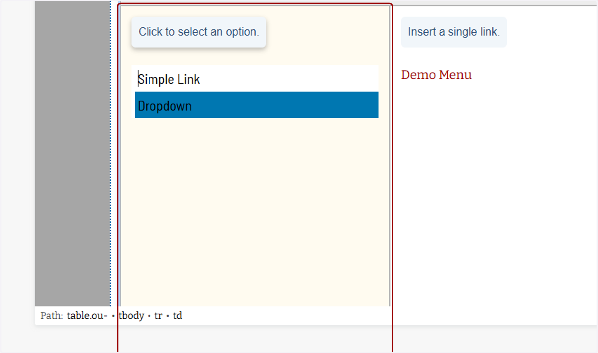
32. Since I want to add second-level catgories to this first entry, I'll select Dropdown.
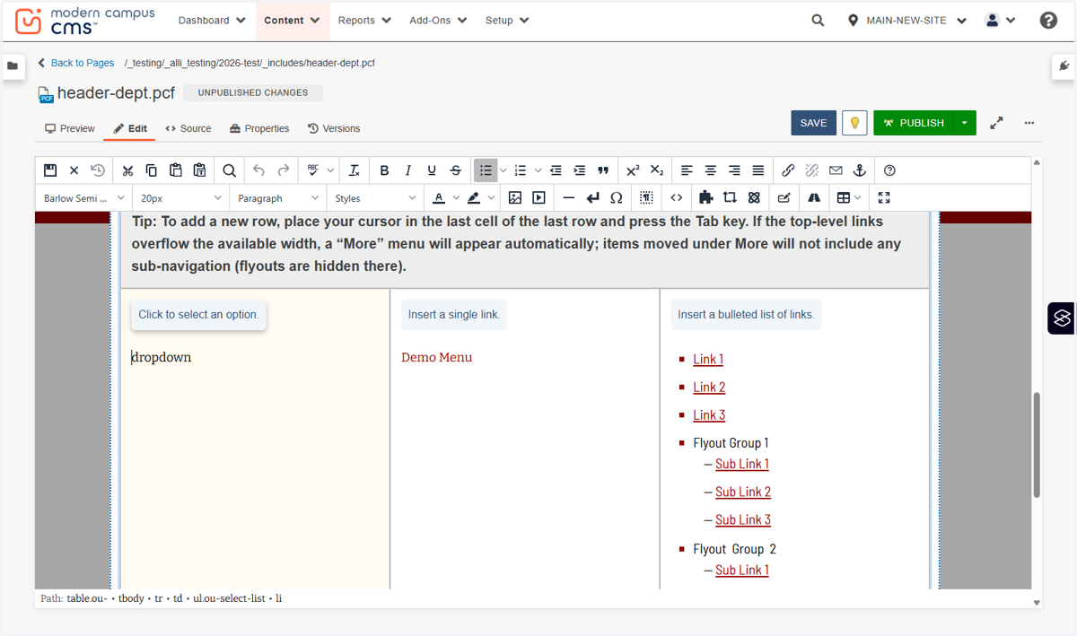
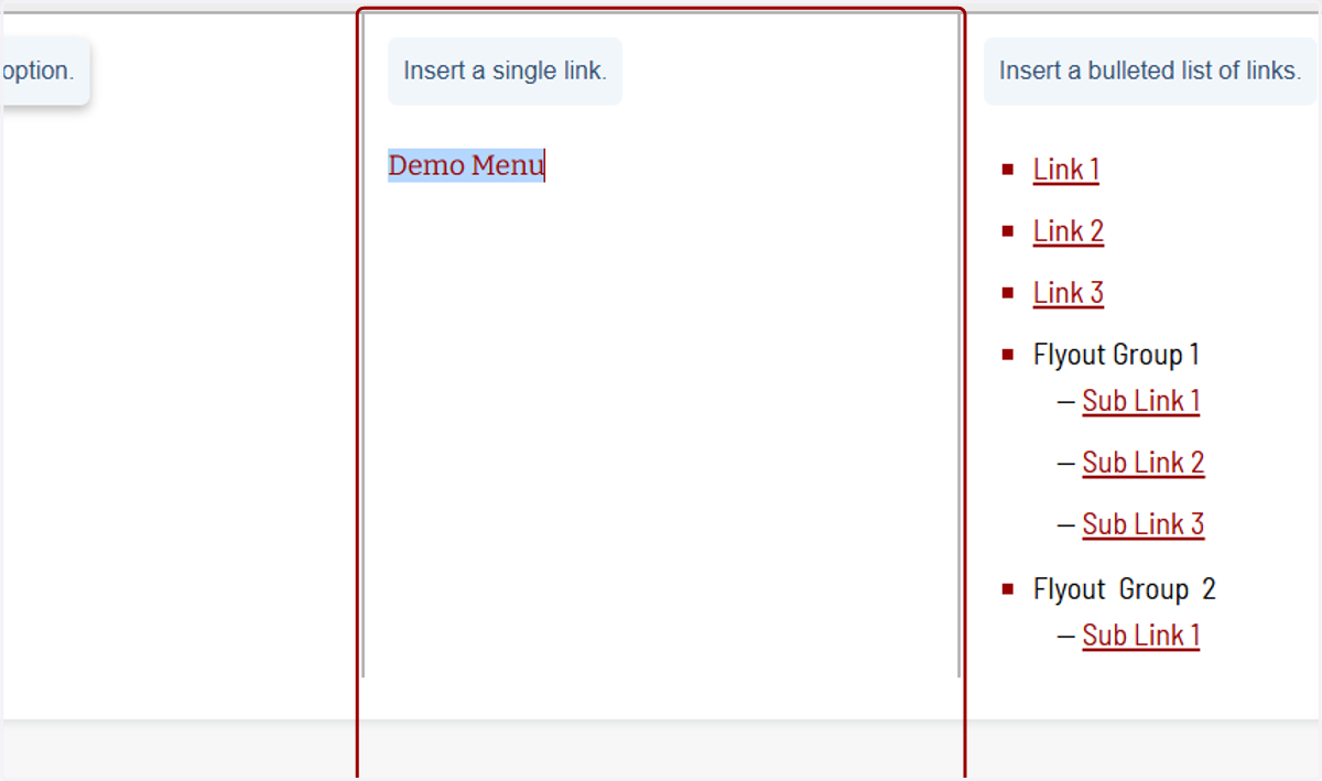
33. This second column shows the top-level category links that will show in the red bar. You'll fill this out regardless if you select a single link or dropdown.
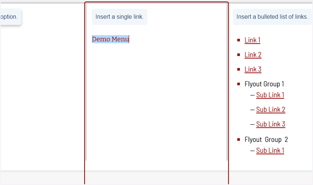
34. Editing this link works just like editing any other link we've done so far, so I'll skip demoing that again for now.
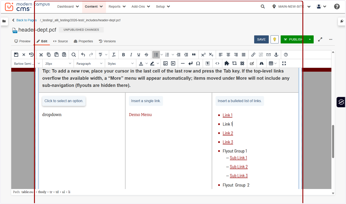
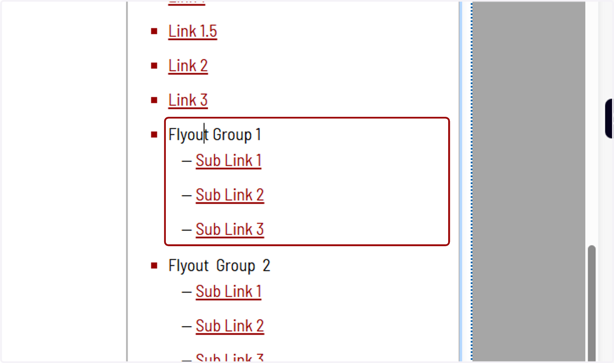
35. The third column is used only when you have Dropdown selected in the row. This is the menu that will show up in the dropdown. The square bullets are the second-level categories, and the line bullets are the third-level categories
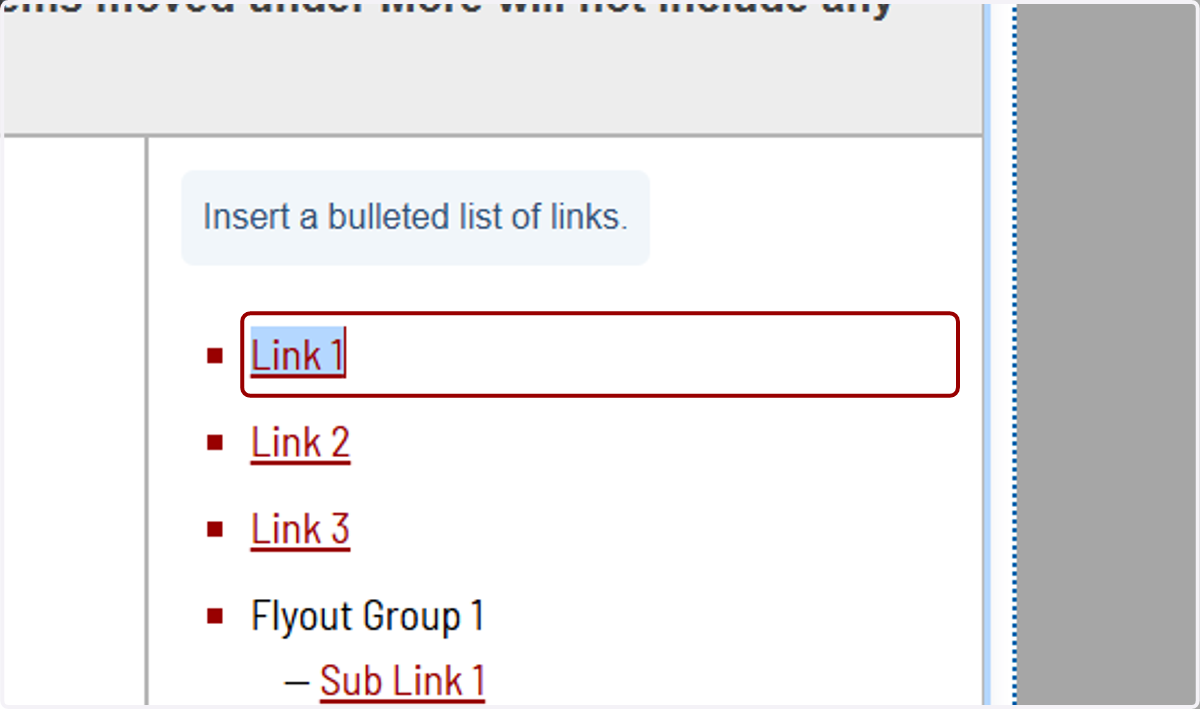
36. Again, editing these links is the same as the others.
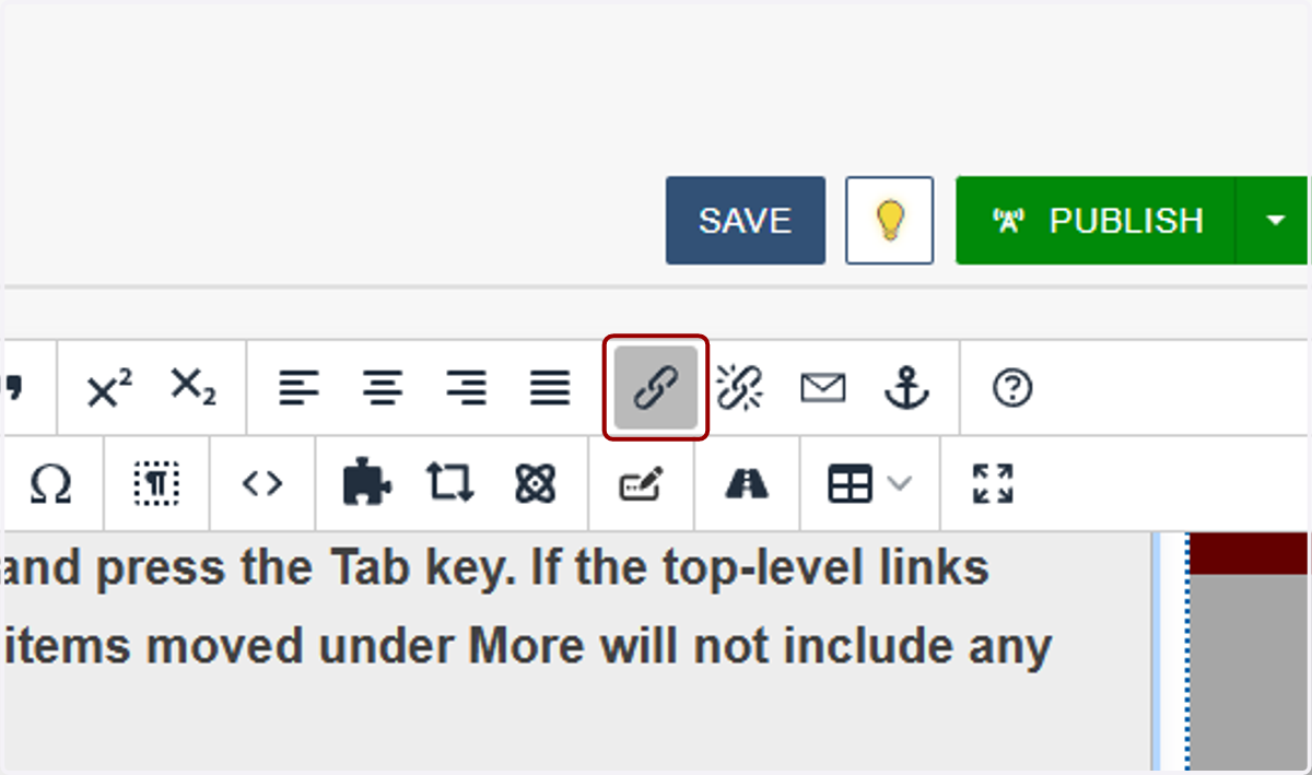
37. To add another link, hit enter and it will add another square bullet. If bullets don't show, you can click the bullet list icon.
38. Flyout Groups should always have a link, even if that page only consists of the same list of sub-links as the flyout and a short intro paragraph.
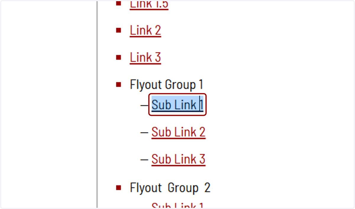
39. Linking third-level links works the same way as the other links we've done so far.
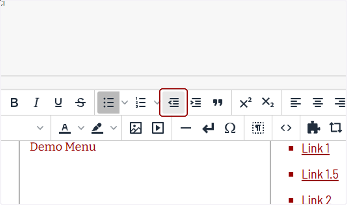
40. You can move between bullet levels by clicking on the Decrease Indent button...
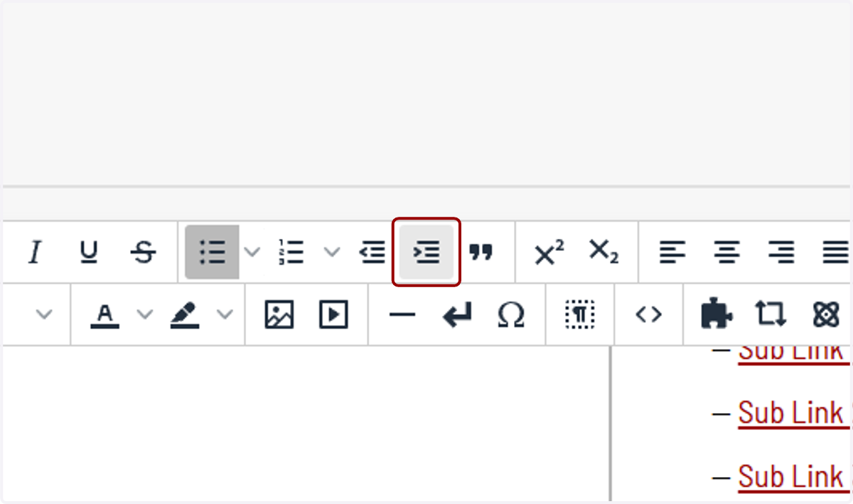
41. ...or Increase Indent button.
42. Now we'll add a Simple Link.
43. This menu type only needs a link in the second column. The third column won't need to be filled out since this won't be a dropdown.
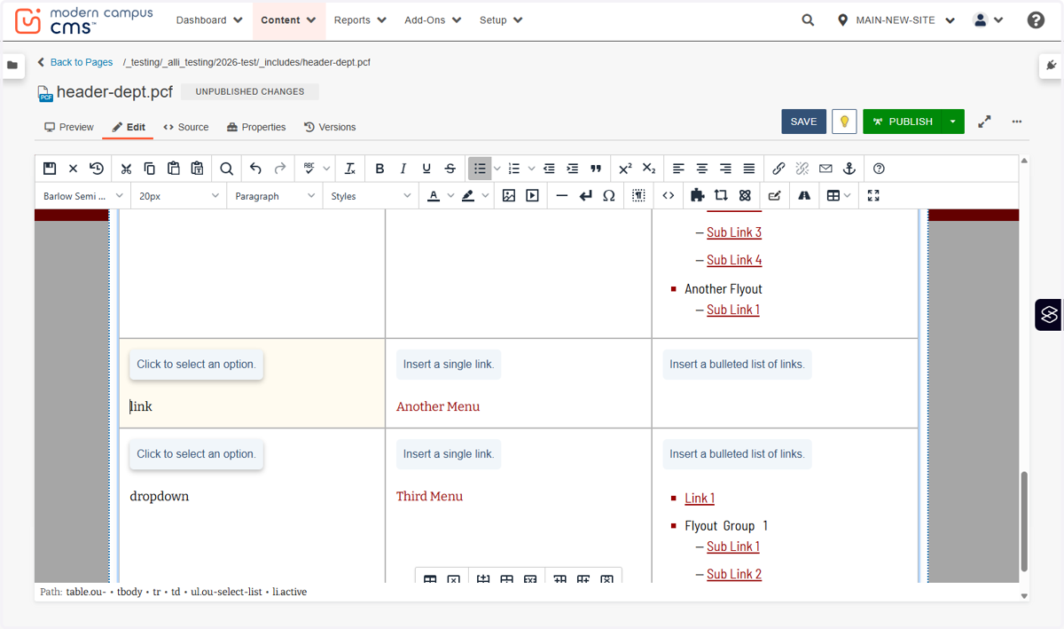
44. Again, this link is added the same way as the others, so we'll skip demoing that for now.
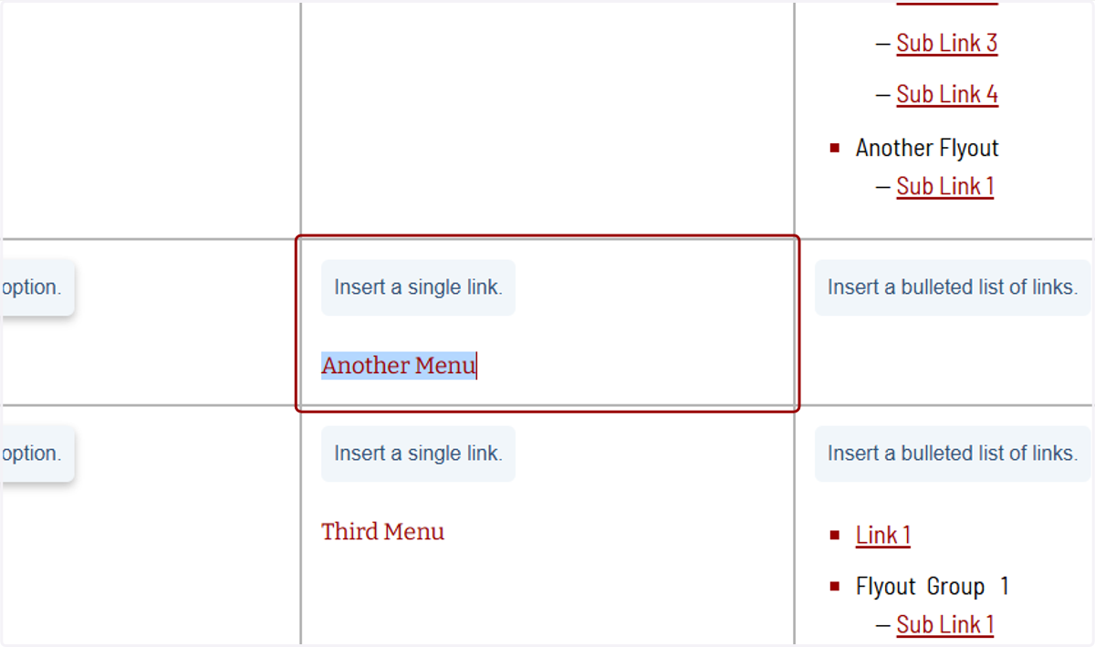
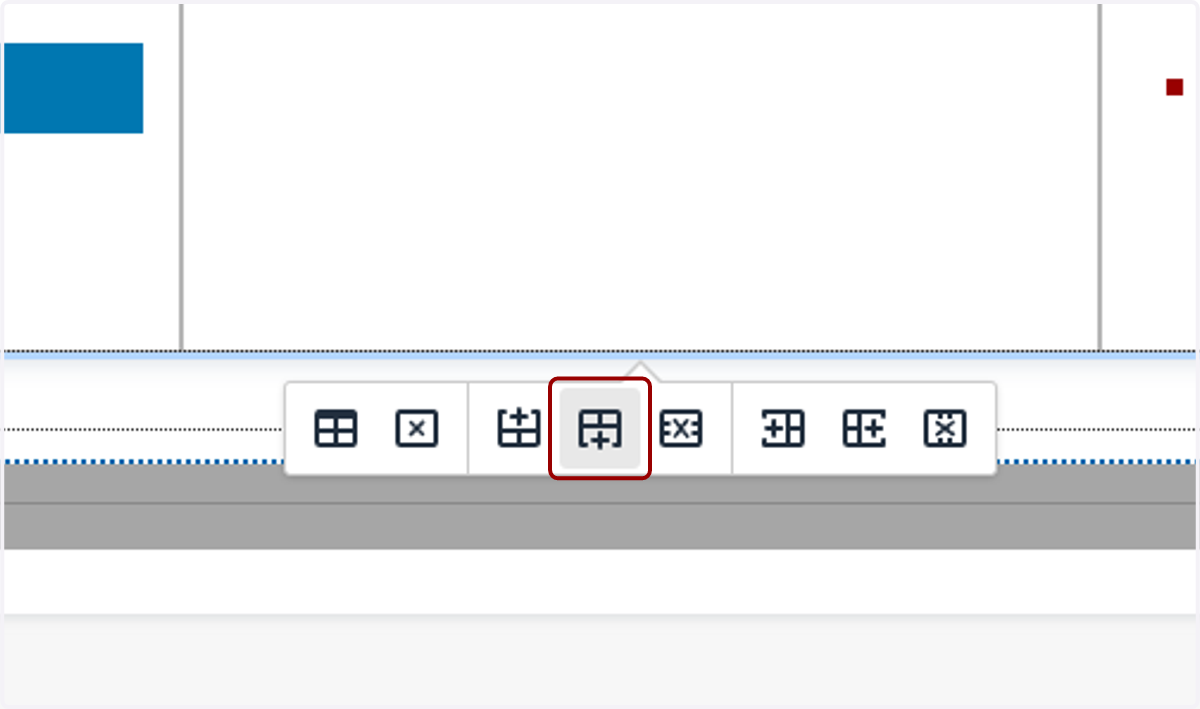
45. If you want to add a new top-level category, you can add a row to the table by clicking either of these row icons with the plus. They'll insert a new row above...
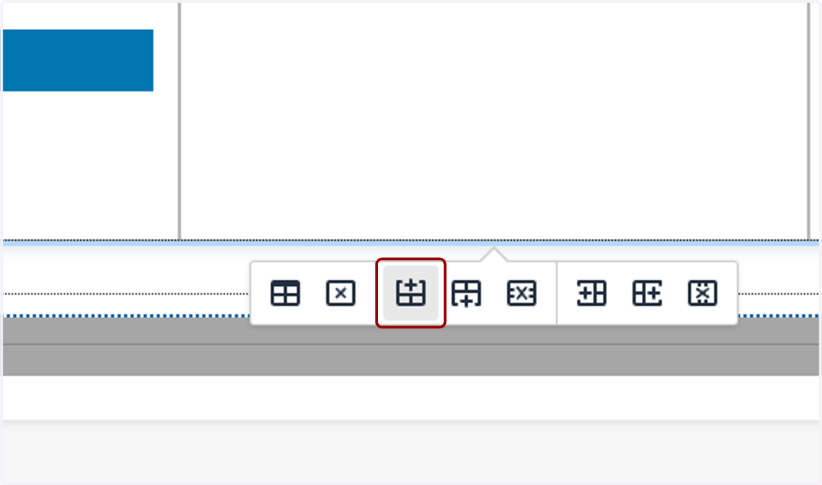
46. ...or below the current row you have your cursor in.
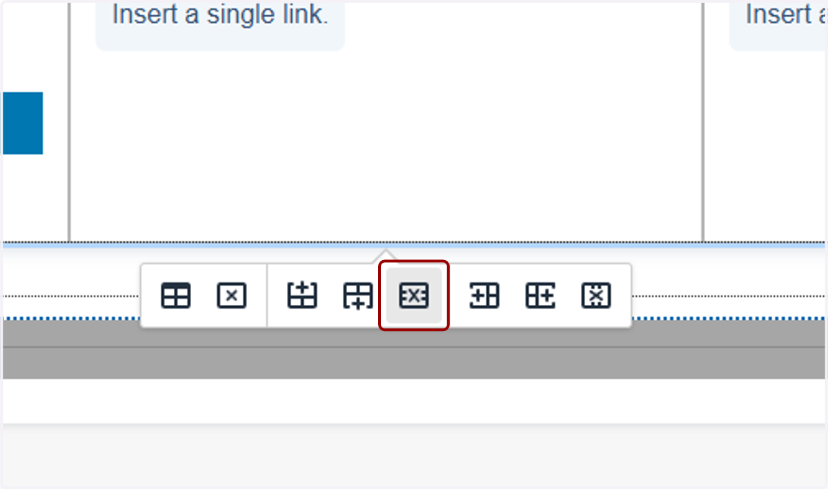
47. You can also delete rows by clicking this X icon.
48. When you're done, click Save at the top of the page.
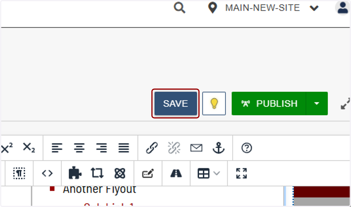
49. You'll see the changes you made in the Edit tab,
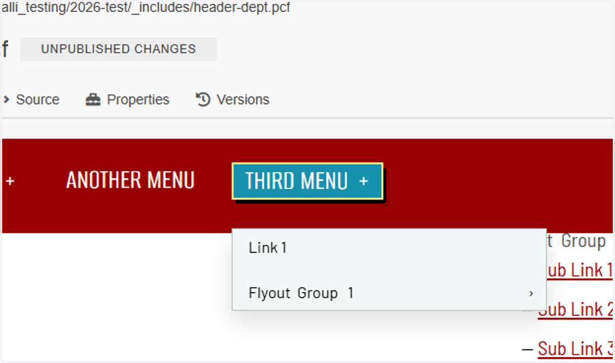
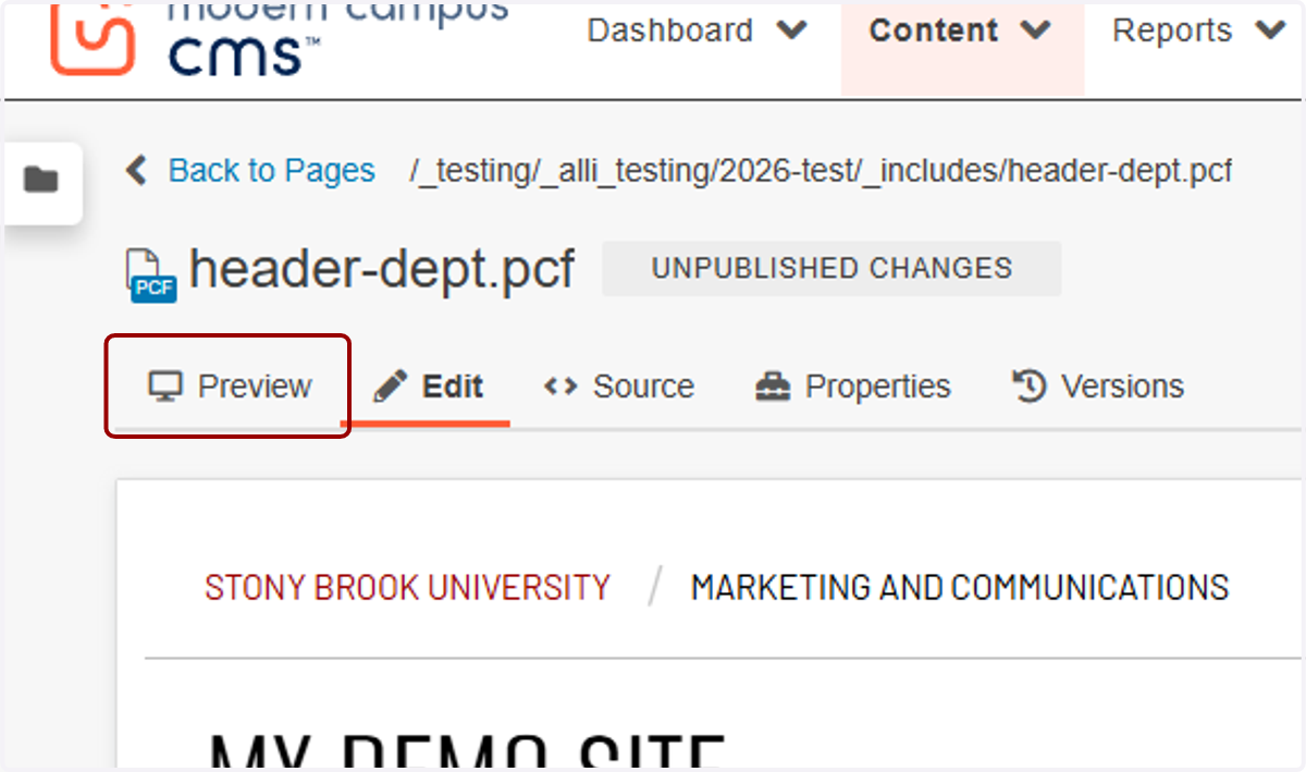
50. and you can see a full preview on the preview tab.
51. And that's how you manage your navigation menus! Publish when you would like your menu to go live.