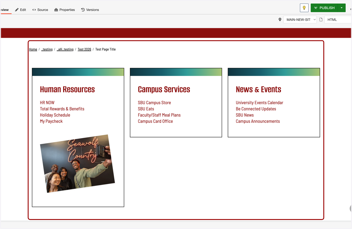
[TUTORIAL] Boxes - Link List Columns
1. First, click on the section you would like to add this component to. In this example, we will be inserting it into Main Content.
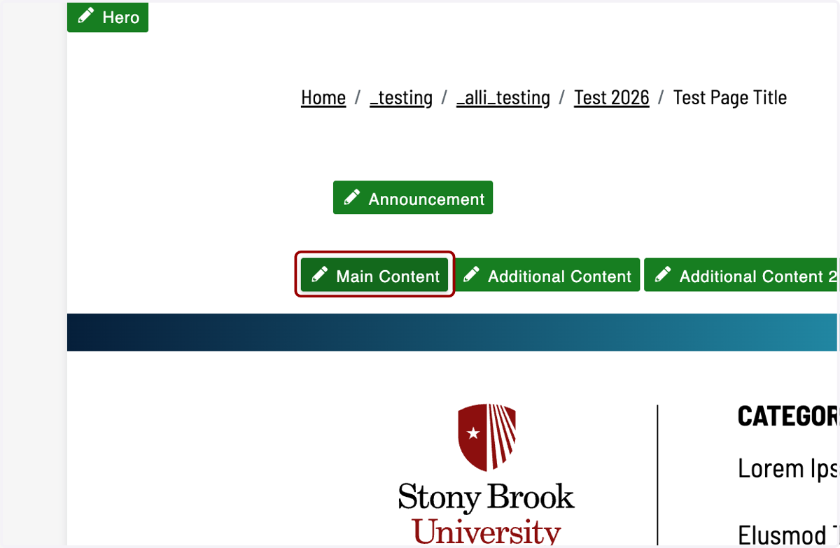
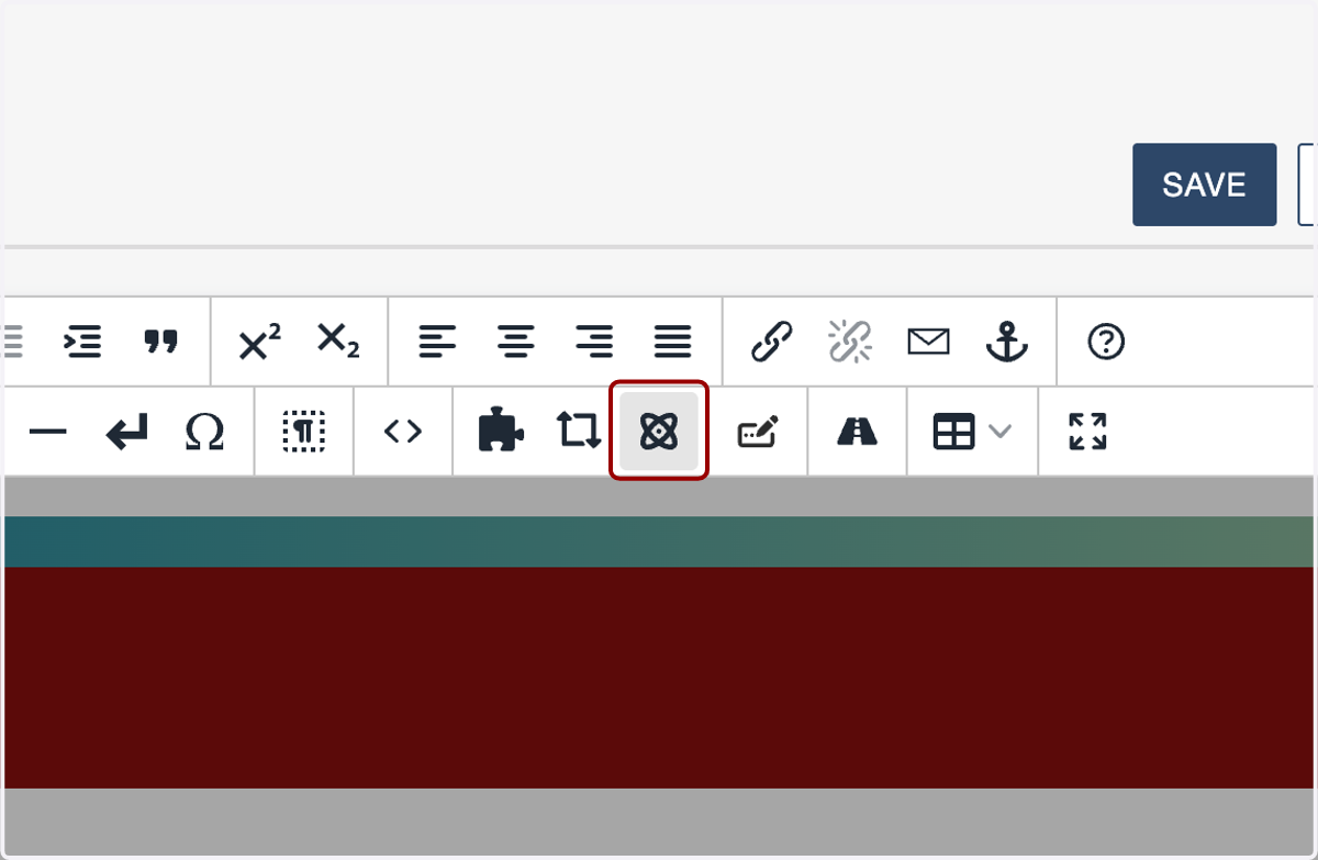
2. Next, click on the Insert Component icon.
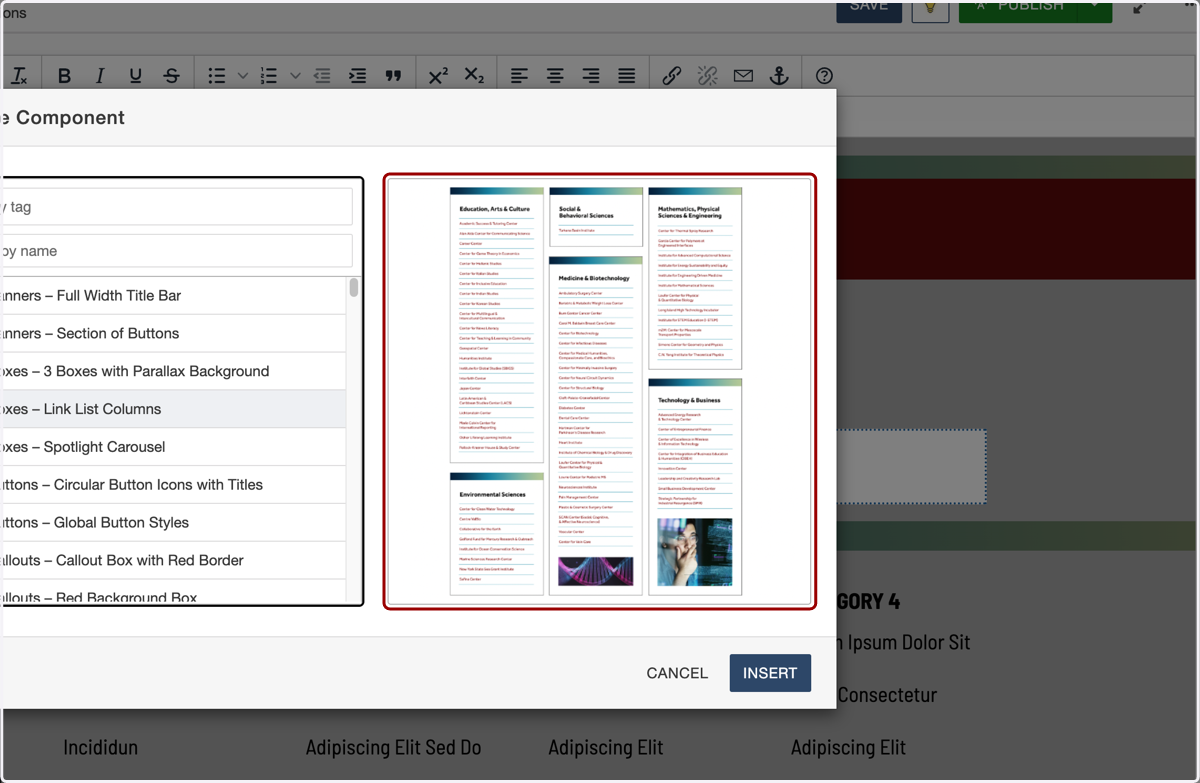
3. Click on or filter by name for the "1_Boxes – Link List Columns."
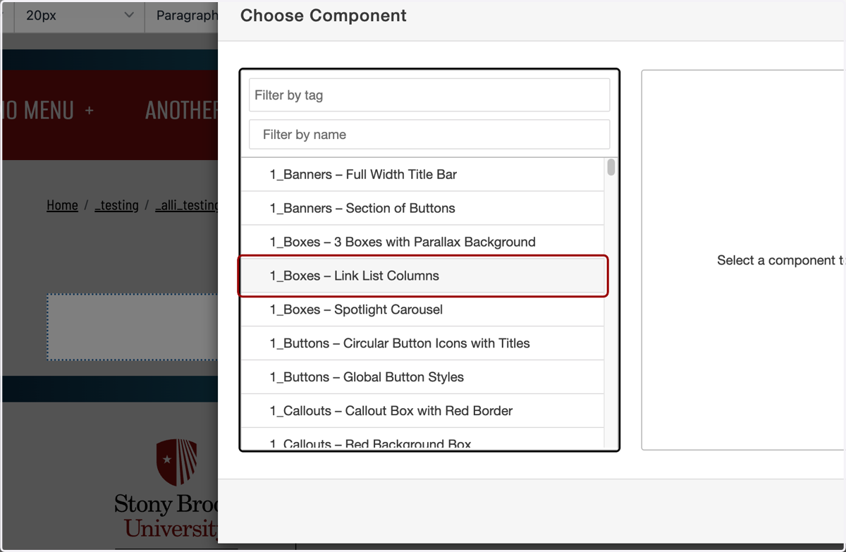
4. You will see a preview of it appear on the right-hand side.
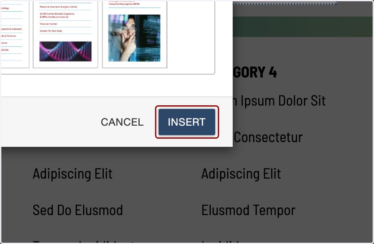
5. Click the Insert button.
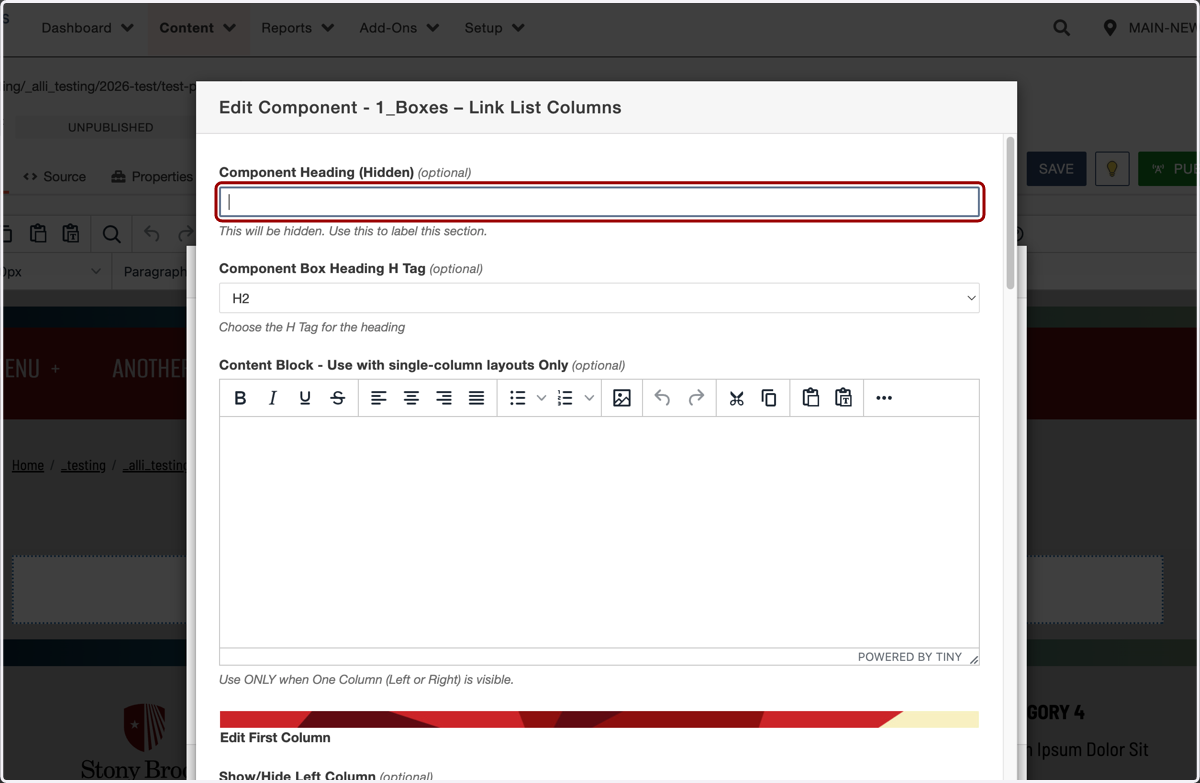
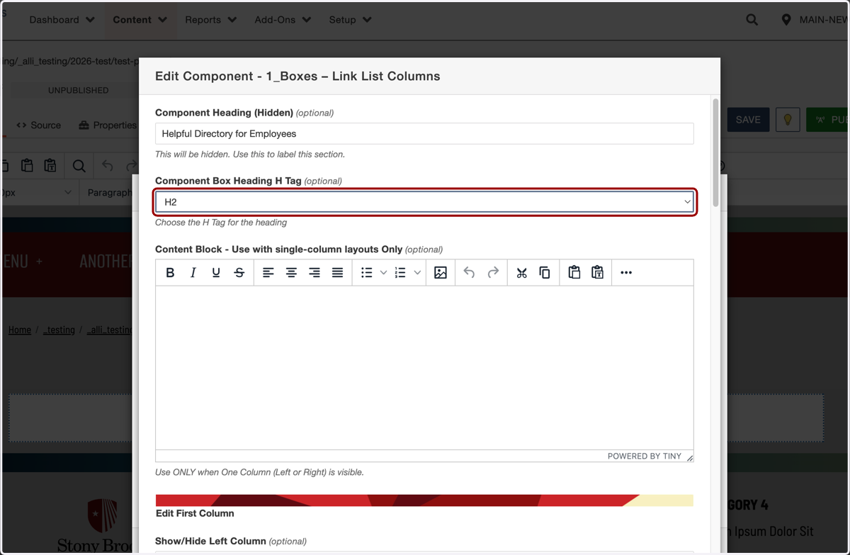
6. The first field is a hidden Component Heading. You will need to use this field to tell screen readers what this Link List Columns section is about. You can describe the section for screen readers here.
7. For this example, I will add "Helpful Directory for Employees" here.
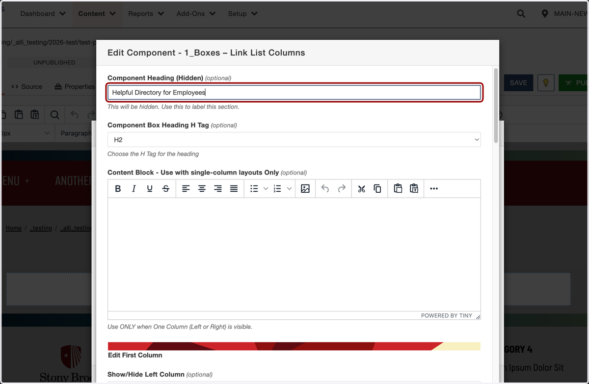
8. Next, you'll select the heading H tag you would like to assign for that hidden headline. Unless you are using this section as the hero of your page, which is unlikely, you will probably want to keep this as the default H2.
For more information about when to use different H tags, see our H tag article.
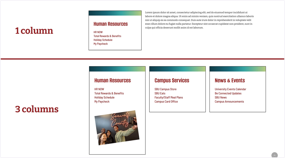
9. This component allows you to have one column of links with content on the side, or three columns of links.
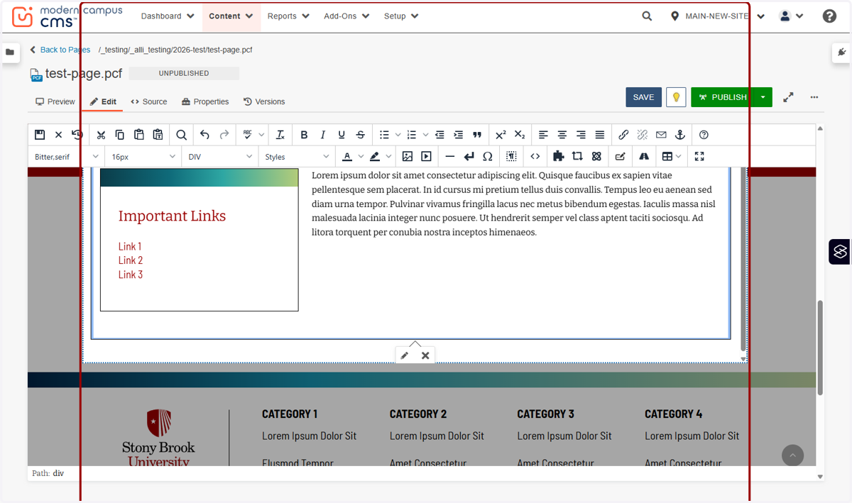
10. The "Content Block - Use with single-column layouts only" allows for one left- or right-hand link box, with a WYSIWYG to add other information on the side.
11. If you select this option, add the content that would sit outside of the box of links to the WYSIWYG Editor.
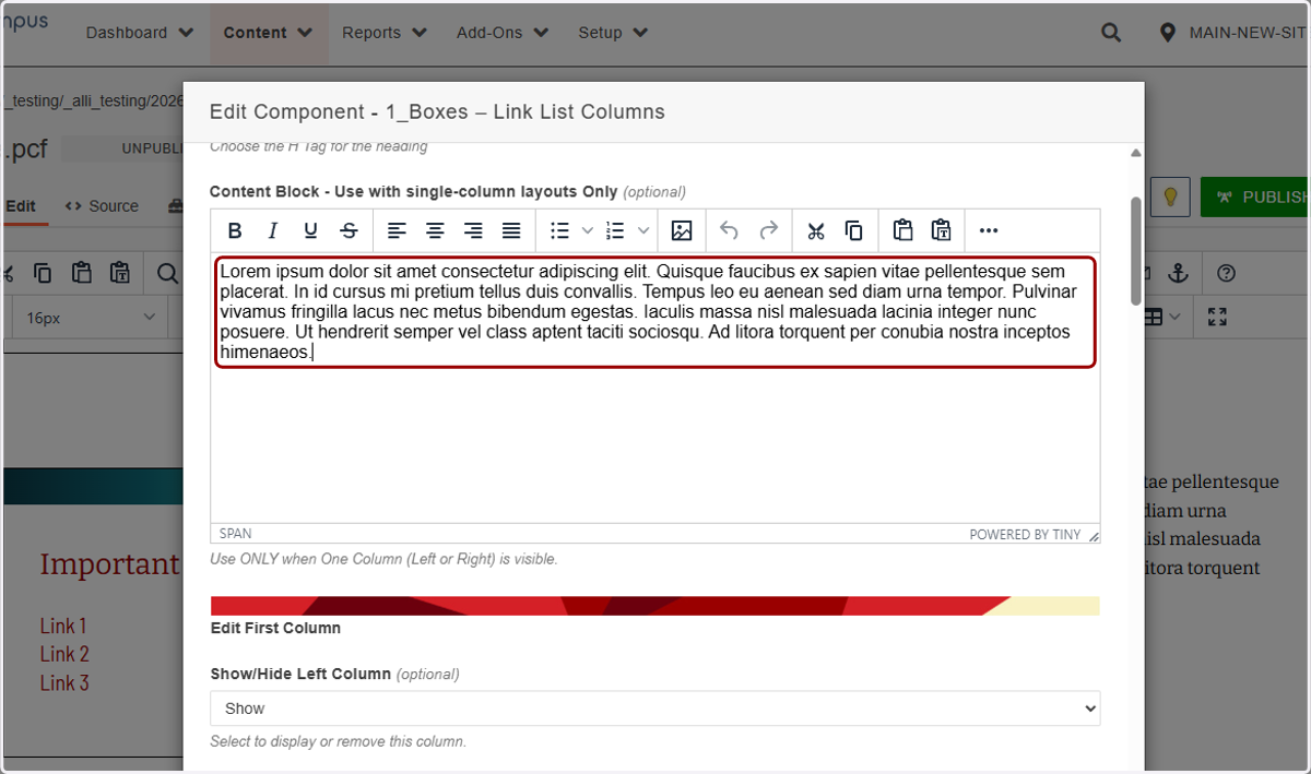
12. Then you would make sure to Show either the left- or right-most column of links only.
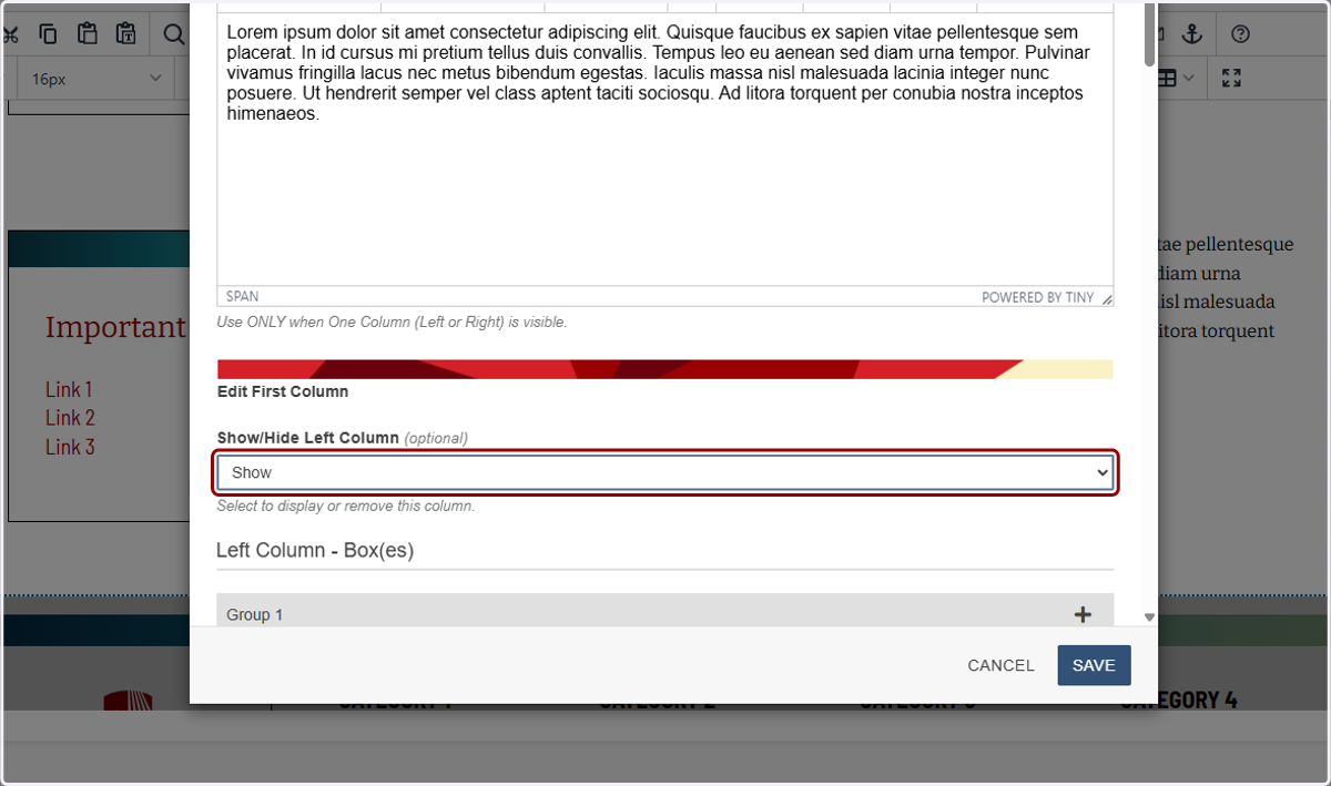
13. If you have more than one column of links, this "Edit First Column" section is where you will add your first list.
Since I want it to show, I'll select Show from Show/Hide Left Column here. If I used the single-column layout only above, I would want to set either this or the third column box to Show, and the other two to Hidden. This will make more sense as we go through the tutorial.
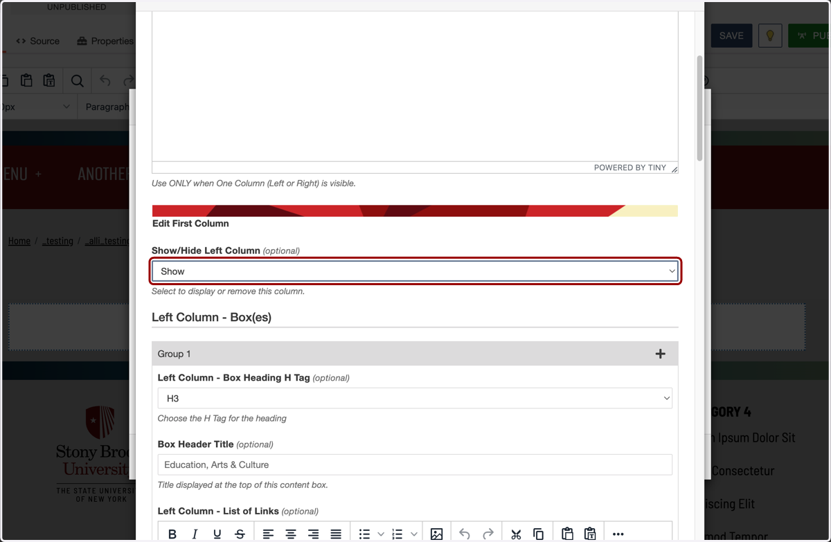
14. Now we'll title the first section in our first column. If you have a hidden or visible H2 headline above, you will want to keep this H tag set to the default H3, since these headlines will support the H2 title.
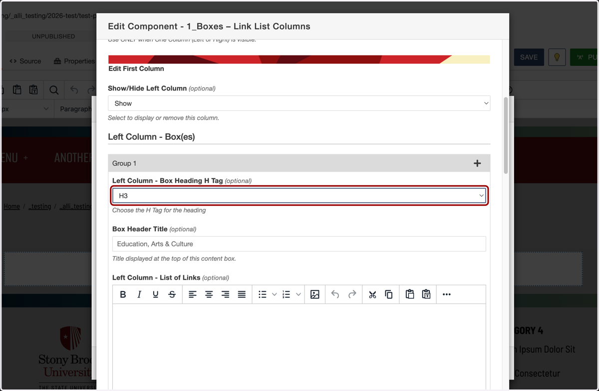
15. In this example, I'm setting up a link directory for SBU employees. Let's call this first section "Human Resources".
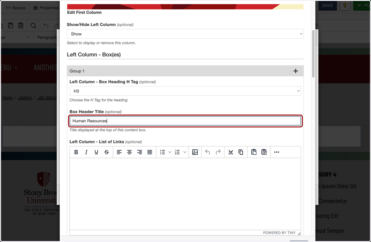
16. In the list of links, I will add my anchor text without bullets, and hit enter after each link I want to add. I'll add HR NOW, Total Rewards & Benefits, Holiday Schedule, and My Paycheck.
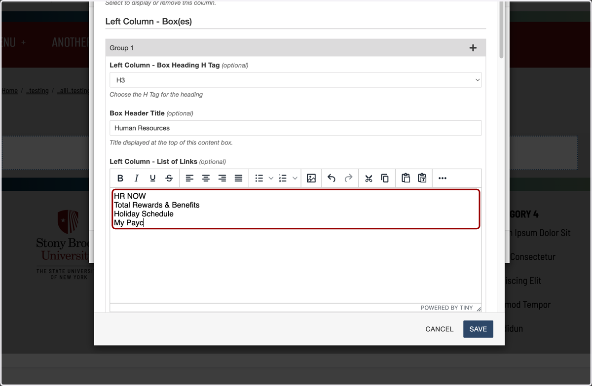
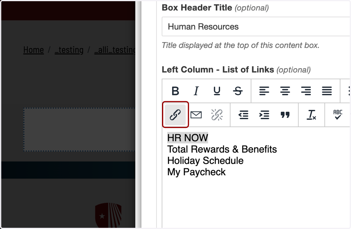
17. Now we will add links to each of these. I'll highlight my first link, HR NOW. The link icon may be hidden in this WYSIWYG. If so, click on the three dots on the far right for More...
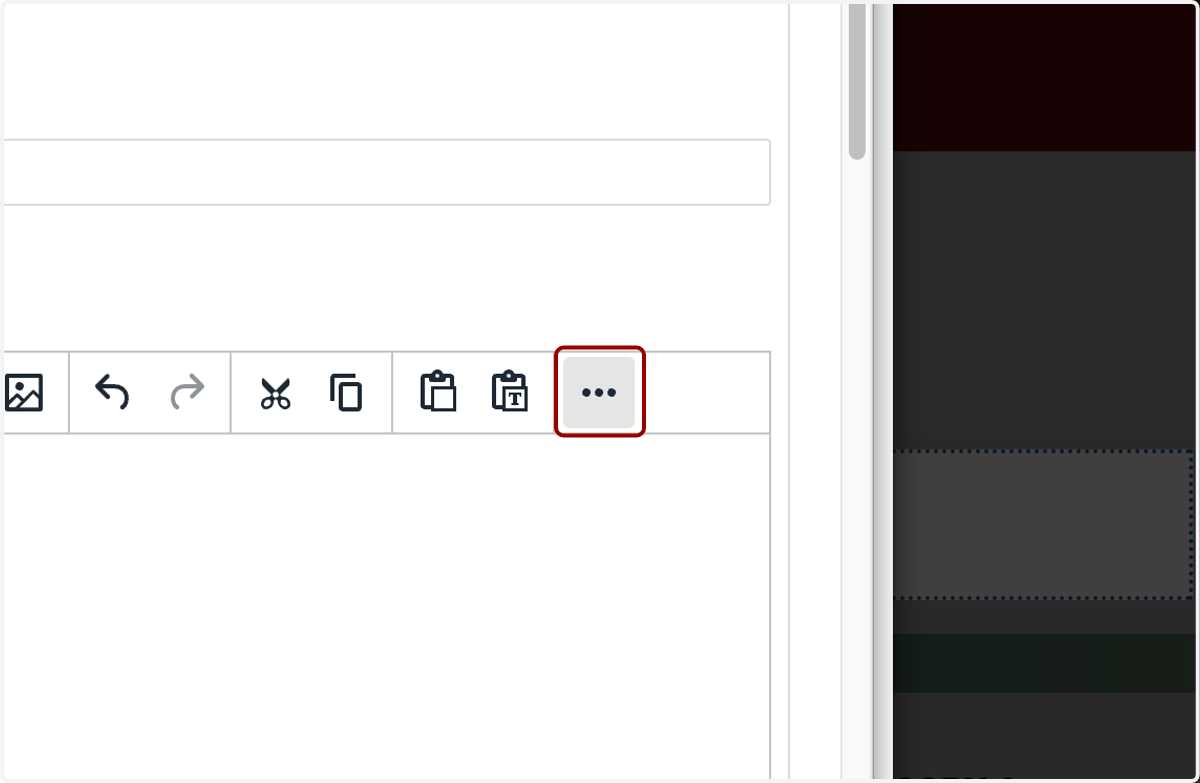
18. ...and find the link icon, which looks like this.
19. I'll paste "https://www.stonybrook.edu/hrnow/" into the URL field. I could also use the file chooser to select a page on my own site.
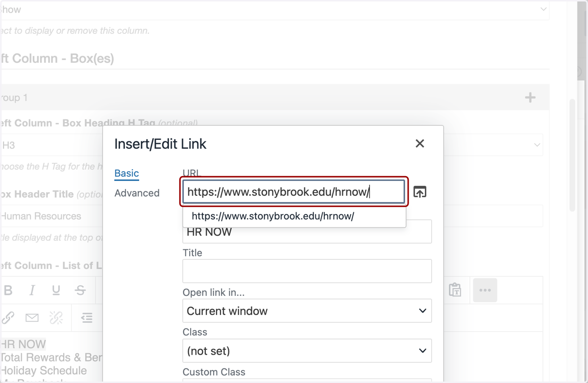
20. If I didn't type out my list in the WYSIWYG earlier, I could add links straight from this Link window and add the text to display here, but I find it easier to type the list first and add the links second. If I wanted to change the displayed text, I could do that here.
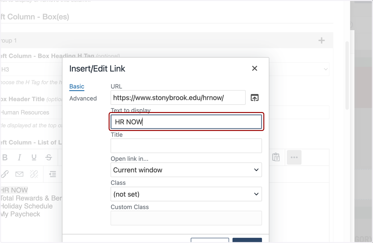
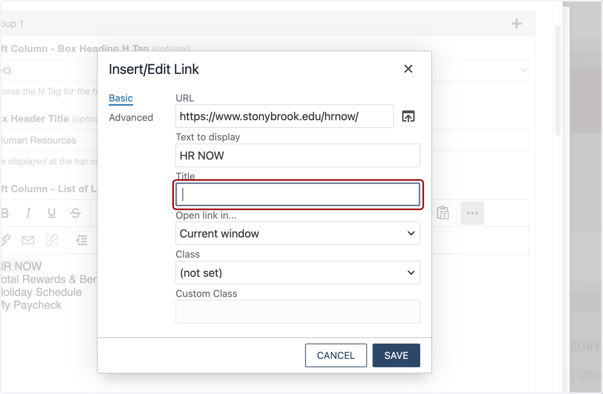
21. The Title field is next, and you will most likely always leave this blank. The Title field sets the link’s HTML title attribute, which appears as a hover tooltip and can provide extra context.
It isn’t visible on the page, isn’t required for accessibility, and shouldn’t replace clear link text. Leave it blank unless you need brief, non-redundant clarification. If I was going to add a title here, it might be something like "Employee HR portal", but I will leave it blank since I don't need it.
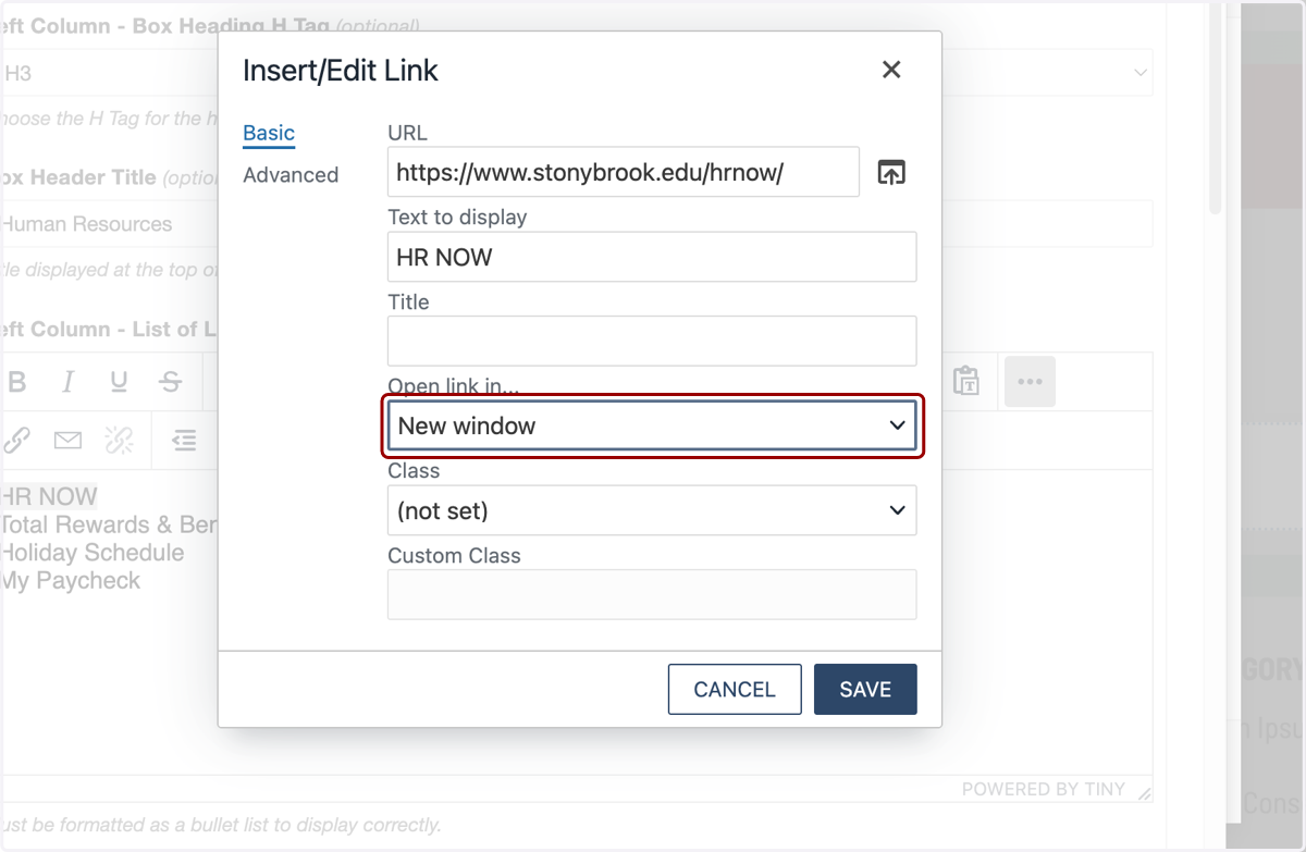
22. I have the option to have this link open in the current window or a new one. Because this goes to a different department's site on stonybrook.edu, I'll select New Window here, but you can set the target however you would like. You can ignore Class and Custom Class fields.
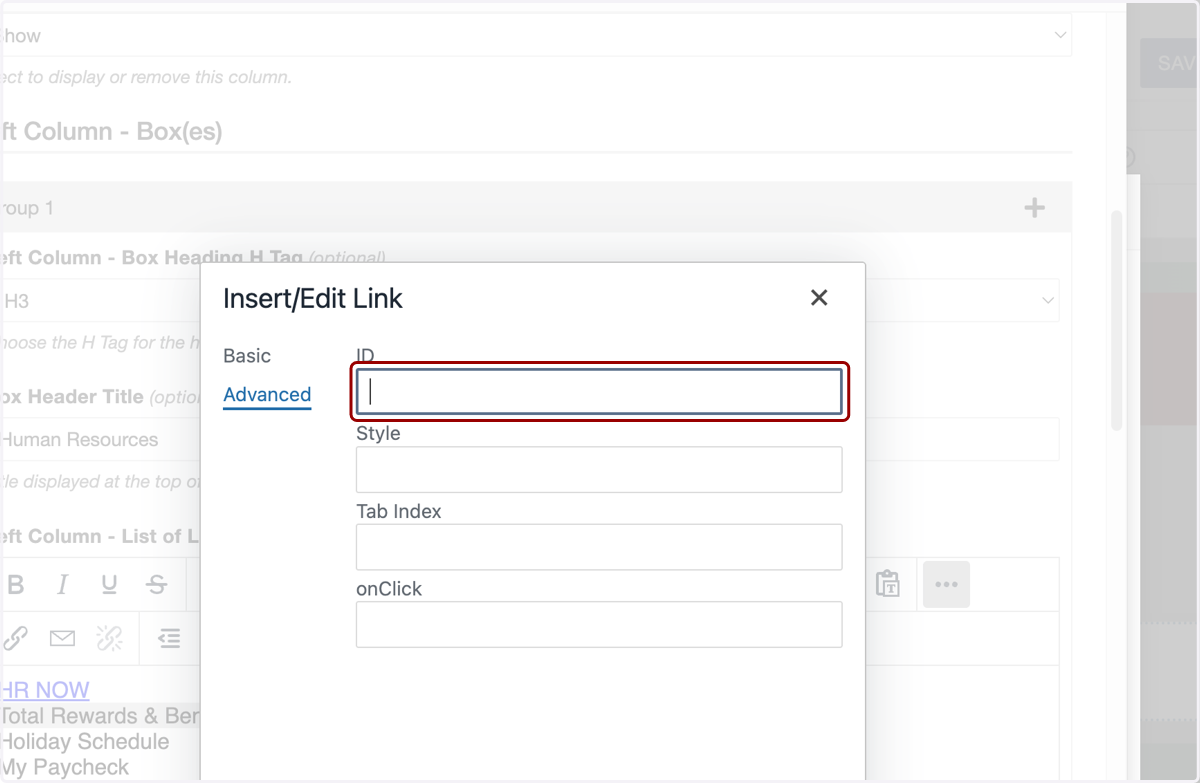
23. You may also notice there's an Advanced tab in this window. These Advanced fields control technical behavior, not content. ID is for anchoring, scripting, or analytics; Style applies inline CSS; Tab Index controls keyboard focus order; onClick runs JavaScript on click.
For most pages, you'll leave these blank unless you have a specific accessibility, tracking, or scripting need. Reach out to the MARCOM Web Services Team if you need more details on these.
24. Now I'll click on SAVE.
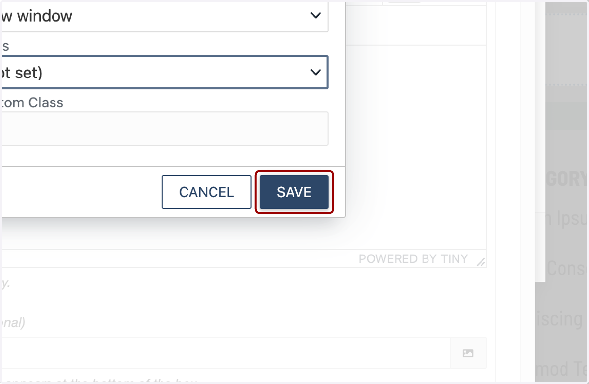
25. We completed our first link. Now I'll repeat those steps for the other links in this section.
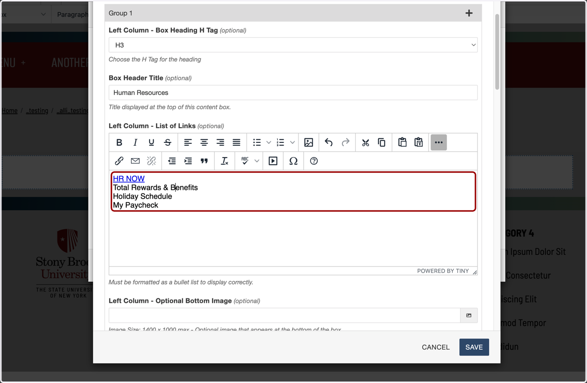
26. I've added the rest of my links and now I'm ready for the next field. Here, you have the ability to add an image to the bottom of any link list.
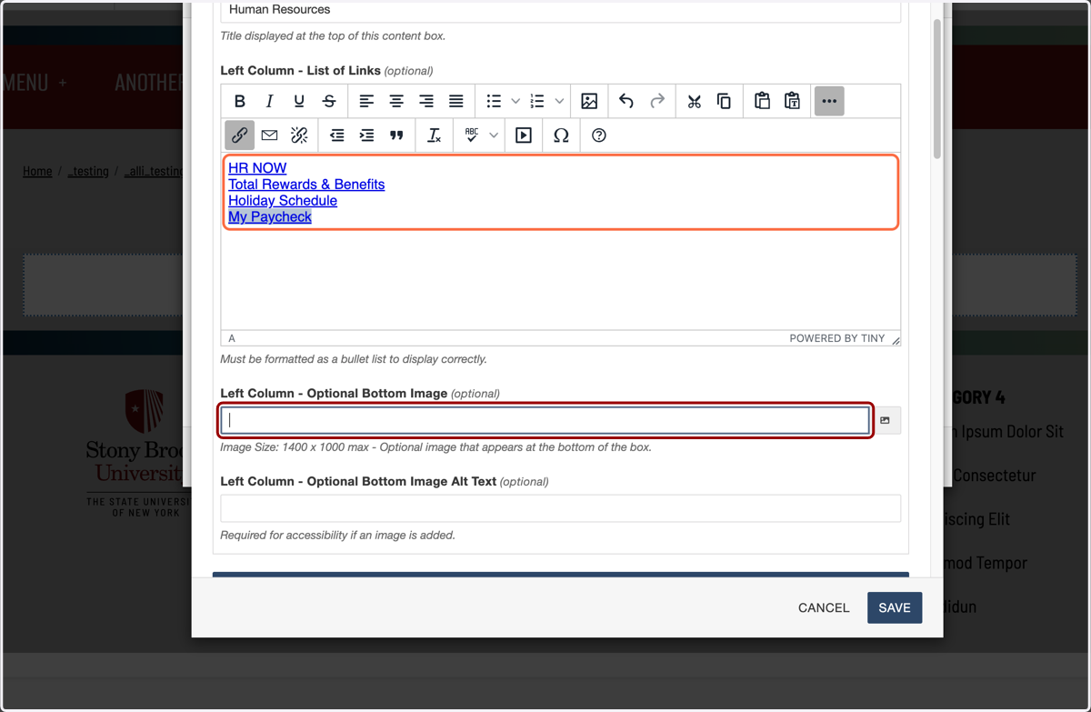
27. The size of the image is up to you. You may want to add tall images to even out your link boxes, or just to add decoration. I'll open the image chooser...
28. ...and navigate to the image I want to use.
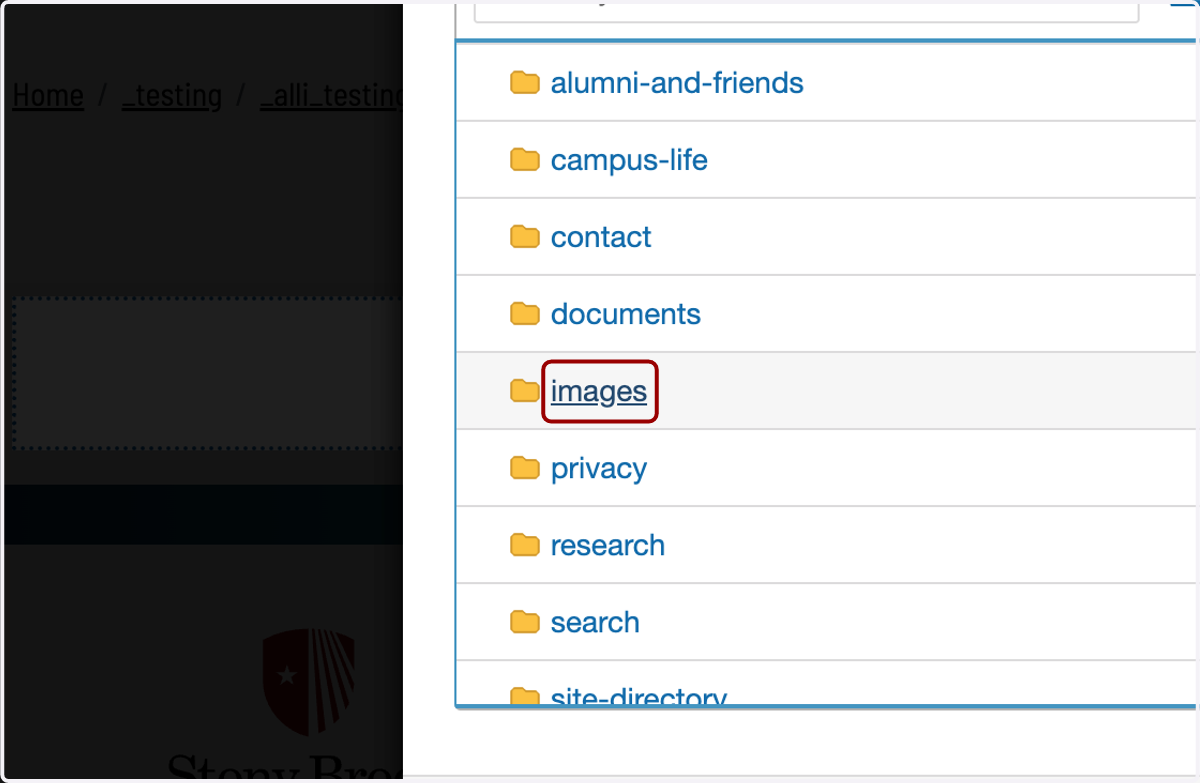
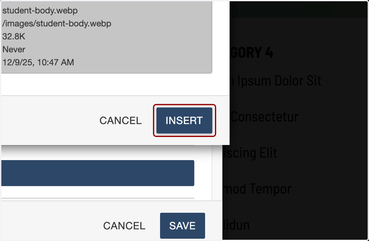
29. I'll click on INSERT on the image I want to choose...
30. ...then add alt text to describe the photo here for screen readers. I'll type "Students smiling and taking a selfie together".
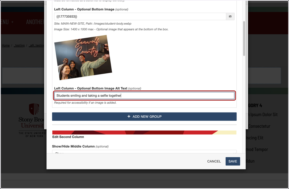
31. I've now finished adding my first box of links to the first column. If I wanted to add another box in that first column, I would click "ADD NEW GROUP" and repeat the steps I just showed you, but I want to have one box of links there for now.
Next, I'll move onto editing the second column.
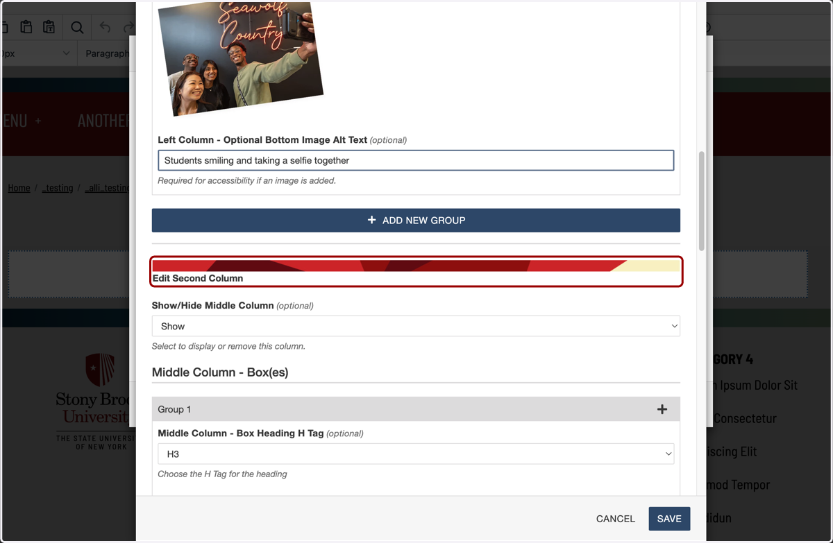
32. I'll follow the same steps again, but I'm not going to add an image.
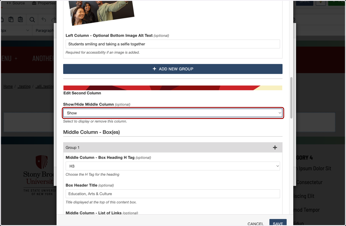
33. I'll call this section "Campus Services," and add my links.
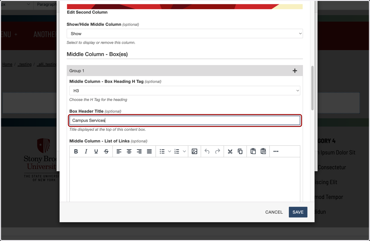
34. I've added my middle column, first box list of links...
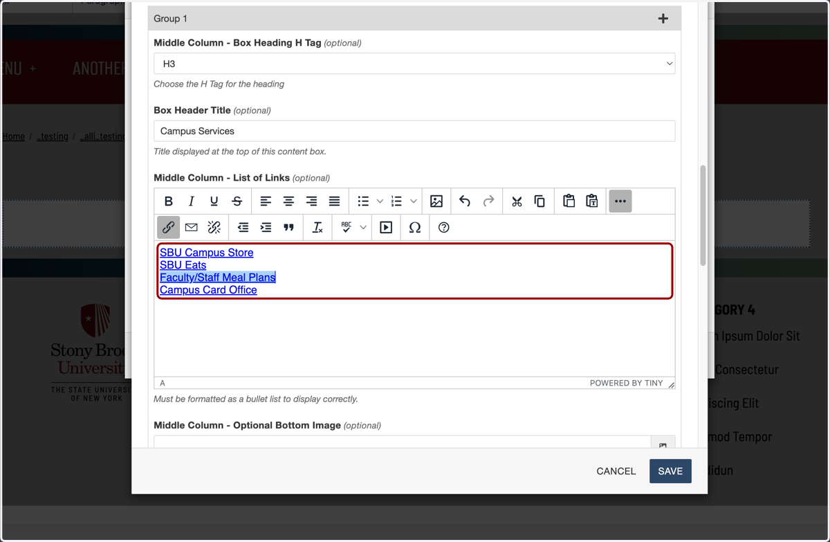
35. ...and will skip adding an image here.
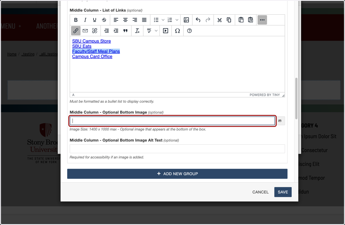
36. Now I'll move onto the third column and repeat those same steps again.
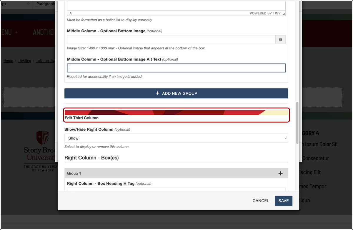
37. I've added these links, and I'm going to skip adding an image here too.
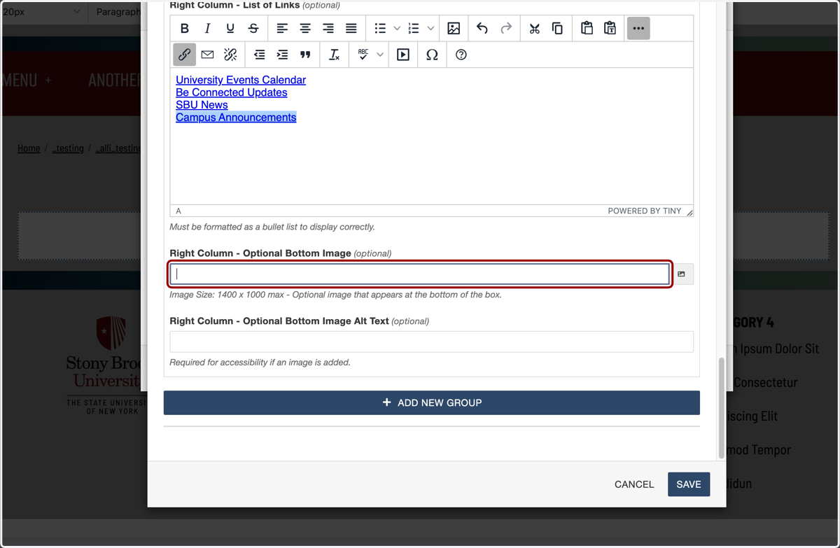
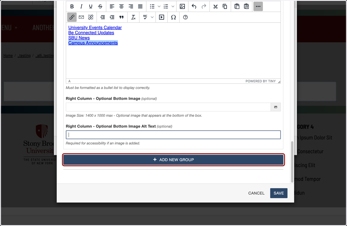
38. If I wanted to add a second box of lists here, I'd click on ADD NEW GROUP...
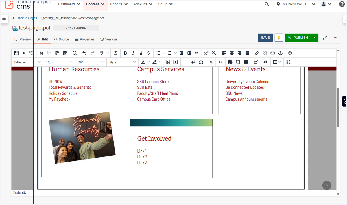
39. ...and add another section of links. Here I added one called "Get Involved" as an example.
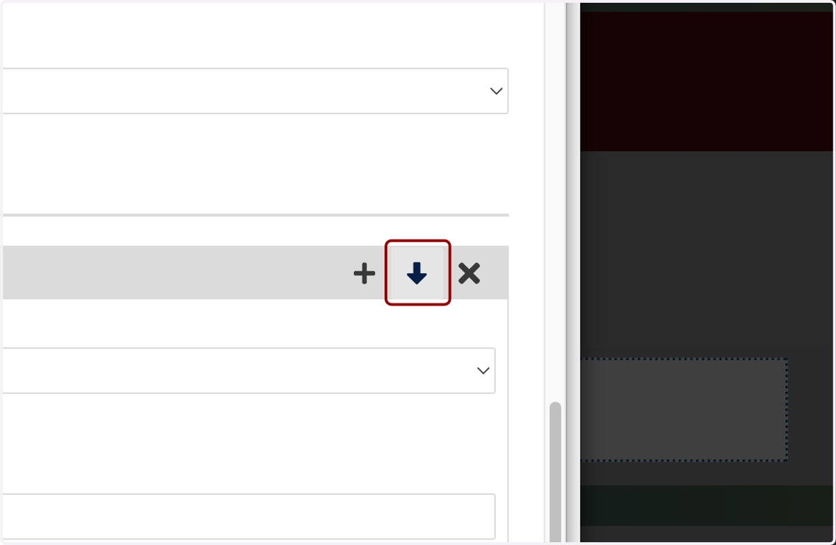
40. I can rearrange the boxes of links by clicking these up and down arrows
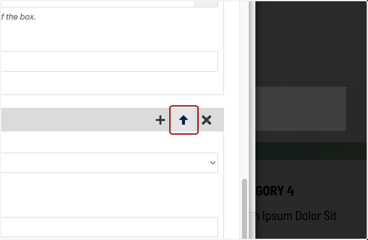
41. Click on Move Element Group down one
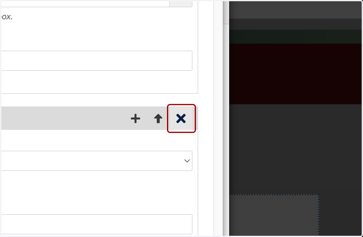
42. I can also delete boxes of links with this X icon.
43. Once I've finished building my link lists, I'll hit SAVE.
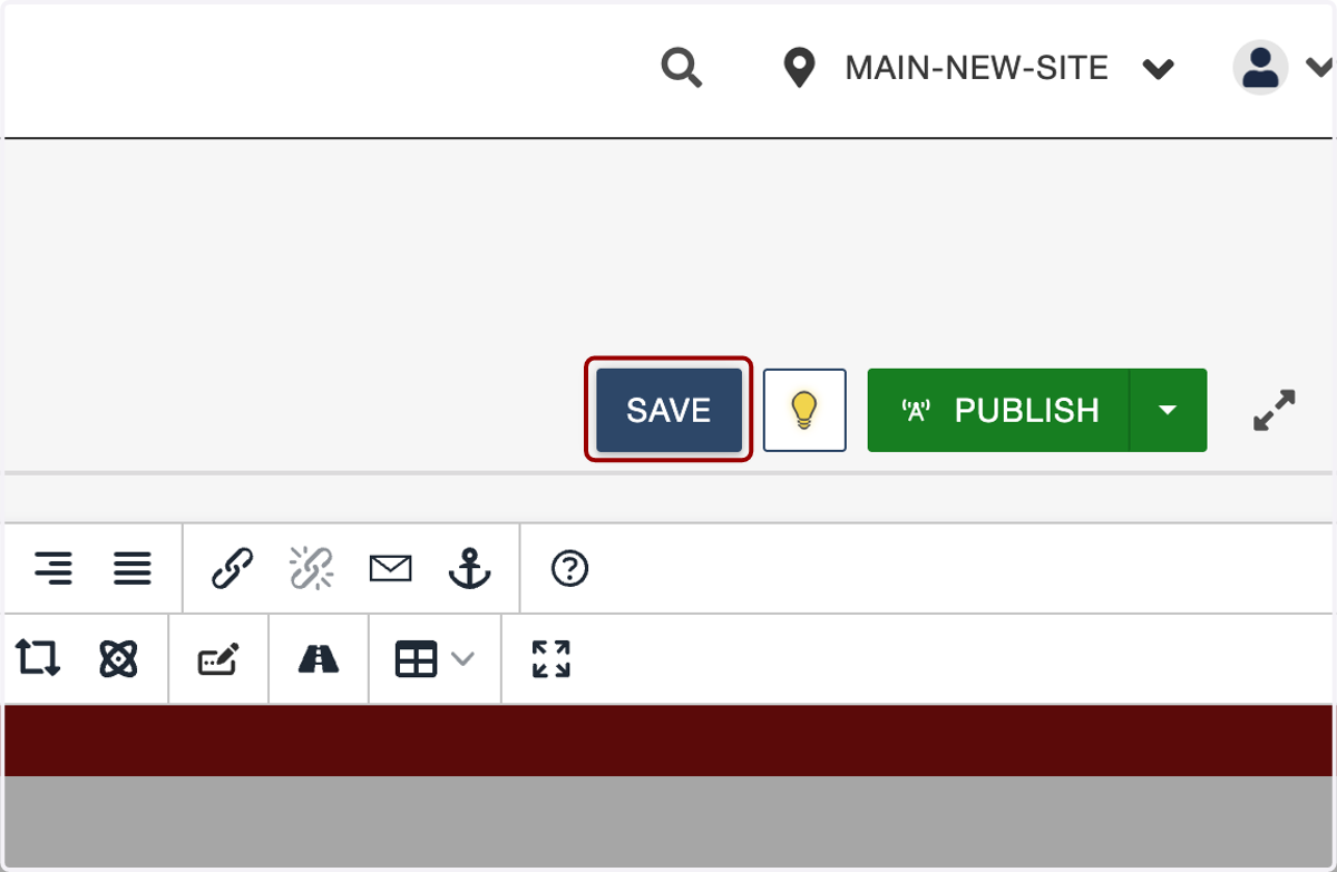
44. Then Save at the top of the page...
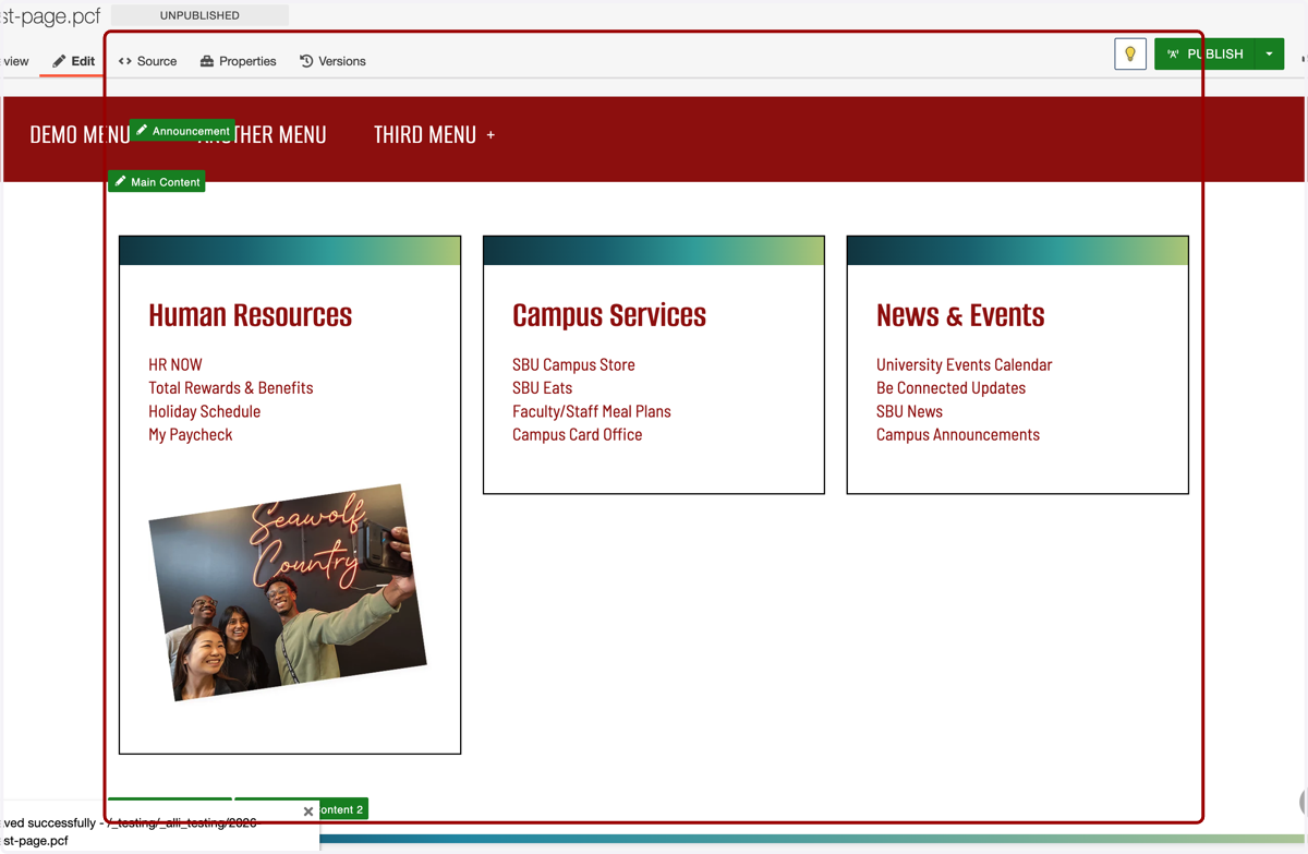
45. ...and here is what we built.
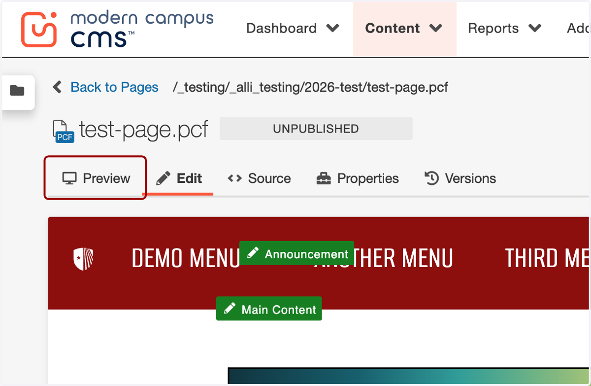
46. I'll preview it on the Preview tab and check my work.
47. Great job!